

Ensuring Seamless Mobile UX Parity Across Multiple Devices
In the dynamic realm of digital marketing, ensuring a consistent user experience across all devices stands as a cardinal element of customer satisfaction.
Companies must embrace the shift to a design philosophy that caters to the varied screen sizes and preferences of desktop users, mobile device aficionados, and tablet enthusiasts alike.
At the core of this challenge lies the commitment to responsive design, which adapts seamlessly to each user’s device, thereby fostering an inviting and friendly atmosphere for engagement and interaction.
Testing and optimizing web content to maintain this mobile ux continuity is not just a best practice; it’s imperative for staying ahead in the competitive digital landscape.
Keep reading to discover strategies and tools that can help achieve a flawless mobile UX parity.
Key Takeaways
- Mobile UX Parity Is Essential for User Satisfaction and Brand Integrity Across Various Devices
- Responsive Design Ensures Accessible and Consistent User Experience, Critical for Higher Search Engine Rankings
- Seamless Navigation and Interaction Patterns Are Paramount for Intuitive Cross-Device User Experiences
- Testing and Optimizing Web Elements Across Devices Is Crucial for Maintaining a Cohesive Digital Interface
- Incorporating User Feedback Helps Refine the Cross-Device User Interface and Aligns With Consumer Expectations
Understanding the Basics of Mobile UX Parity

In an era where device diversification has become the norm, the concept of mobile UX parity emerges as a fundamental tenet of digital marketing strategies.
This principle entails creating an equalized user experience across a spectrum of devices, ensuring that each visitor – whether on a mobile device, desktop, or tablet – is greeted with a consistent, user-friendly interface.
The emphasis on mobile UX parity not only heightens user satisfaction by providing a frictionless transition from one device to another but also reinforces brand integrity through a uniform digital presence.
As companies navigate the intricacies of responsive design and content optimization, mastering mobile UX parity lays the foundation for an engaging customer journey, irrespective of screen size or platform.
Explaining Mobile UX Parity and Its Importance
Mobile UX parity is a design philosophy that warrants meticulous attention, as it directly impacts the customer’s digital interaction with a brand. When a visitor’s experience is consistent across various devices, it engenders trust and boosts engagement, leading to better conversion rates and reinforced customer loyalty. It is increasingly evident that consumer behavior tilts toward brands that offer a seamless, device-agnostic experience.
From an SEO perspective, search engines are cognizant of the user experience, ranking websites that are mobile-friendly higher in the search results. Aligning web design with best practices for mobile UX ensures a company’s website is accessible and appealing not only to users but also to the algorithms that dictate online visibility. In essence, achieving mobile UX parity is not simply about aesthetics; it’s about constructing a robust foundation that supports both user engagement and search engine optimization.
The Impact of Mobile UX Parity on User Satisfaction
Striving for mobile UX parity is critical for a company to meet evolving consumer demands, as dissimilar experiences can lead to lost interest or negative perception. By harmonizing the interface and features across different platforms, organizations seal the gaps in the user journey, fostering a positive user experience that resonates with an audience’s expectations of a modern, digital-savvy brand.
Remarkably, seamless mobile UX parity serves as a pivotal element in bolstering employee satisfaction as well. As employees often double as consumers, the fluidity of a web app or mobile site within the work ecosystem can significantly uplift morale, productivity, and promote a culture of efficiency and technological adeptness within the organization.
The Role of Mobile UX Parity in Brand Consistency
The dedication to maintaining mobile UX parity is a key ingredient in cementing a brand’s consistent image in the digital landscape. A unified interface across devices projects a cohesive and dependable brand personality, which is crucial for building and sustaining consumer trust in an increasingly competitive market.
Reputable companies recognize that an integral aspect of their branding involves delivering steadfast and synchronized experiences. Mobile UX parity instills confidence in customers, assuring them of the same quality interaction whether accessing content through a mobile app or a desktop version, thus fortifying brand loyalty.
Strategies to Achieve UX Consistency Across Devices

In the quest to solidify a brand’s digital presence, the pursuit of mobile UX parity has risen to the forefront.
Accomplishing consistent user experiences across disparate devices demands an astute focus on certain critical strategies.
Prioritizing core features and functionalities ensures a streamlined approach that resonates with the user’s primary needs.
Concurrently, forging a consistent design language is essential for visual and functional coherence.
Moreover, synchronization of interaction and navigation patterns is pivotal, as it addresses the fluidity with which users navigate and interact, regardless of their chosen device.
These strategies form the pillars of a seamless user-centric design framework that is vital for maintaining brand consistency and elevating the overall digital user interface.
Prioritizing Core Features and Functionalities
To establish mobile UX parity, it is imperative to hone in on the core features and functionalities that define the essence of a brand’s digital offering. This requires organizations to discern and prioritize the elements that are most impactful for their audience, ensuring those components are flawlessly adapted and accessible across all versions of their web presence.
A rigorous application of an On-Page Audit Tool can assist developers in identifying any discrepancies in the user experience, allowing them to refine the interface to support seamless accessibility. It is through this thoughtful calibration of features and functionalities that enterprises can guarantee a congruent and engaging user experience on every device.
Establishing a Consistent Design Language
Achieving a harmonious digital interface necessitates the formation of a consistent design language, which acts as the visual and interactive thread that seamlessly connects the web experience across various platforms. This pursuit of design symmetry not only reinforces a brand’s identity but also augments the user’s navigational intuitiveness, regardless of the device in use.
The introduction of a cohesive design system, complete with guidelines on typography, color palettes, and interactive elements, empowers developers to forge digital environments that exude familiarity and ease, fostering an enriched user experience that is synonymous with the company’s ethos. In this space, consistency is king, shaping perceptions and user engagement in profound ways.
Synchronizing Interaction and Navigation Patterns
Achieving mobile UX parity across devices necessitates the synchronization of interaction and navigation patterns, which helps eliminate user confusion and enhances familiarity across different platforms. As companies develop their digital environments, ensuring that menus, buttons, and gesture controls operate consistently is integral for allowing visitors to intuitively navigate interfaces, whether accessed via a mobile device or a traditional desktop site.
Uniformity in user interface behavior is critical to cultivating an environment where consumers can engage with content with confidence and ease. Organizations must diligently orchestrate the user flow so that each transition, swipe, and tap yields predictable results, effectively minimizing the learning curve and optimizing user engagement across all versions of a site.
Responsive Design: A Cornerstone for UX Parity

Responsive design stands as the linchpin in achieving mobile UX parity, anchoring a seamless transition of digital experiences across diverse devices.
It hinges on the principles of adaptability, ensuring web design is fluid and responsive to different screen sizes, orientations, and resolutions.
At its core, responsive design necessitates proficiency in crafting flexible layouts and media queries, forming the backbone for a device-agnostic interface.
It is through meticulous testing on a variety of devices that companies can assure a consistent and engaging user experience, fortifying the bridge between brand and consumer within the digital domain.
Principles of Responsive Web Design for UX Parity
Responsive web design is grounded in a framework that responds intuitively to varying screen sizes, maximizing usability and ensuring a quality user experience. Designers achieve this by employing fluid grid layouts that adapt content to fit different resolutions, along with flexible images that scale seamlessly to meet the demands of diverse devices.
In the pursuit of UX parity, developers leverage media queries to conditionally apply CSS styles, thus preserving functionality and appearance across devices. This practice is essential for maintaining the integrity of the user’s interactive journey, presenting uniformity that aligns with the organization’s digital narrative and elevating the overall experience.
Mastering Flexible Layouts and Media Queries
Mastering flexible layouts and media queries is crucial in responsive web design and mobile UX parity. It allows developers to create web pages that fluidly resize and reorganize content to align with the dimensions and capabilities of the user’s device. By prioritizing this adaptability, organizations present a consistent, accessible digital experience regardless of whether visitors browse on a desktop or mobile device.
Employing media queries facilitates style application based on the characteristics of the user’s device, such as screen size, resolution, and orientation. This precise control over design elements ensures that each visitor encounters an interface that feels tailored to their needs, embodying the principle of responsive design and reinforcing a seamless user experience:
- Fluid grids scale and transform content layouts to fit diverse screen sizes, maintaining usability and visual integrity.
- Flexible images and CSS styles adapt seamlessly to various resolutions, crucial for creating consistency across devices.
- Conditional CSS rules, determined by media queries, optimize design and performance, tailoring to the individual’s browsing environment.
Testing Responsive Designs Across Multiple Devices
Implementing responsive designs necessitates rigorous testing across an array of devices, a process that verifies the integrity of user interactions and the visual consistency of web elements. This evaluation phase is pivotal, as it uncovers any functional or aesthetic aberrations that might disrupt the uniform user experience, anchoring the success of a responsive design strategy.
During this critical testing phase, a brand’s commitment to UX parity is put to trial, with quality assurance teams scrutinizing the responsiveness of layouts, the readability of text, and the accessibility of navigation on devices ranging from smartphones to desktop computers. The outcomes from these tests inform refinements that bring the digital experience to a level of excellence, ensuring every visitor is met with a seamless interface regardless of their chosen device.
Overcoming Challenges in Multi-Device UX Design

As the digital landscape becomes more intricate, the quest for mobile UX parity presents a kaleidoscope of design and development hurdles.
Overcoming these challenges demands attention to the diverse ecosystem of user interfaces, where varied screen sizes and resolutions mandate a versatile approach to web design.
Beyond mere appearance, input methods range from the tactile intricacies of touchscreens to the precision of mouse clicks, necessitating a design that accommodates the full spectrum of human-device interaction.
Ensuring accessibility amid this variety is a paramount concern, as organizations are charged with the responsibility of delivering an equitable user experience that honors the principles of inclusive design.
Addressing these facets is essential in mitigating the complexities inherent in crafting a consistent and cohesive multi-device user experience.
Addressing Varied Screen Sizes and Resolutions
In the pursuit of mobile UX parity, addressing the myriad screen sizes and resolutions is paramount for designers. Ensuring that a website is versatile and comprehensible on any device forms the backbone of a truly responsive and user-centric design. The adaptability of a site’s layout to fit a compact smartphone screen, as well as the expansive canvas of a desktop monitor, is critical for maintaining visual continuity and functional integrity.
Organizations today are tasked with the intricate challenge of optimizing digital content so that it renders immaculately on various displays. This obligation involves a meticulous blend of technical precision and creative insight to guarantee that all users, regardless of the device they choose, are offered an exceptional and consistent experience with the brand’s digital interface.
Tackling Diverse Input Methods From Touch to Mouse
In the digital realm where the lines between devices blur, tackling diverse input methods becomes a critical component of ensuring seamless Mobile UX Parity. Organizations must adeptly design interactive elements that function with the touch-centric philosophy of mobile devices while retaining the precision and familiarity of mouse interactions on desktop computers.
This careful consideration promotes a unified experience, effectively removing any potential barriers a user might face when shifting between touchscreens and mouse-driven interfaces. The following points outline the key considerations for maintaining input method consistency:
- Design interactive elements to support both touch and mouse inputs.
- Ensure buttons and link spacing accommodate fingertip sizes for touch while also being clickable via a mouse pointer.
- Implement gesture controls that are intuitive across both platforms, such as swipe actions on mobile devices and comparable mouse-driven alternatives.
Ensuring Accessibility in a Multi-Device Environment
Ensuring accessibility in a multi-device environment is an indispensable part of achieving mobile UX parity, demanding that developers and designers create interfaces that are navigable and comprehensible for all users, including those with disabilities. Central to this effort is the incorporation of assistive technologies and adhering to WCAG guidelines, which serve as beacons for crafting experiences that are inclusive for users who interact with content through various assistive means on any given device.
Organizations play a critical role in removing barriers to accessibility, thereby nurturing an environment where interactive features and information are equally perceivable to all visitors. By embedding accessibility into the DNA of responsive design, companies ensure that their digital presence is universally approachable, reinforcing the commitment to a positive user experience for every customer, irrespective of the device they use to access the web.
Leveraging Cross-Platform Design Tools

Amidst the diverse landscape of mobile and desktop interfaces, ensuring a coherent and user-friendly experience across numerous devices is critical for fostering customer satisfaction and brand loyalty.
This quest for seamless mobile UX parity necessitates a strategic selection of cross-platform design tools that are capable of synchronizing user experiences.
By choosing robust solutions for consistent UX design, utilizing collaborative tools, and streamlining processes through shared assets, organizations can drive the efficiency and efficacy of their digital strategies.
These tools are not just a convenience; they are an essential component of the infrastructure that underpins a cohesive, device-agnostic approach to digital interaction, one that resonates powerfully with both consumers and search engines alike.
Choosing the Right Tools for Consistent UX Design
Selecting the optimal tools for consistent UX design across various platforms is pivotal to achieving mobile UX parity. Crafting a seamless user experience hinges on the deployment of powerful software solutions that enhance collaboration and maintain design consistency throughout the development process.
Tools that facilitate the sharing of design components, enable real-time updates, and integrate user feedback loops are essential for developers and designers striving to deliver a cohesive user experience across every touchpoint:
| Design Aspect | Tool Functionality | Impact on UX Parity |
|---|---|---|
| Collaboration | Real-time editing and version control | Ensures consistency in design elements |
| Component Sharing | Reusable assets and style guides | Streamlines design process across platforms |
| Feedback Integration | User testing and comment features | Refines user interfaces based on direct input |
Streamlining the Design Process With Shared Assets
Streamlining the design process with shared assets is a strategic move that bolsters consistency across mobile and desktop experiences. By utilizing a central repository of design elements and assets, teams ensure that every component reflects the current brand guidelines and interaction design principles, facilitating a coherent experience irrespective of the device.
Shared assets not only simplify the workflow for designers and developers but also significantly reduce the scope for inconsistency or error across multiple platforms. This approach to design enables a synchronized appearance and functionality, underpinning the very essence of mobile UX parity and reinforcing the brand’s commitment to delivering a uniform user experience.
Collaborative Tools That Support UX Parity
Empowering teams with collaborative tools marks a significant advance in upholding mobile UX parity. These tools afford design and development teams a shared space to synchronize their contributions, effectively eliminating disparities between mobile and desktop experiences as they evolve in real-time.
By integrating platforms that support iterative design and collective feedback, organizations can ensure that each update reflects a consensus on user experience standards. The active use of these collaborative tools anchors a cohesive workflow that upholds the stringent requirements of cross-device consistency.
Testing and Optimizing for Mobile UX Parity

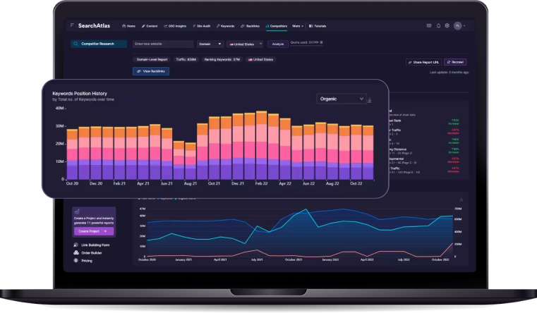
In the realm of digital marketing, Search Atlas stands out as a comprehensive suite, uniquely designed to optimize the synergy between various online campaign efforts. The Search Atlas toolkit encompasses a range of functionalities that play a crucial role in enhancing the overall digital marketing strategy.
Among its multifunctional toolkit, meticulous testing and optimization processes are integral for assuring mobile UX parity. Search Atlas empowers marketers and website owners to conduct in-depth testing and optimization, ensuring that the user experience is seamless and consistent across different devices. This is particularly crucial in an era where mobile devices play a dominant role in online interactions.
These processes are underpinned by an analytical approach involving key metrics evaluation, which illuminates the nuances of user engagement across devices. Through the sophisticated analytics capabilities of Search Atlas, businesses gain insights into user behavior, allowing them to make data-driven decisions for improving the overall user experience.
Through the judicious application of A/B testing, brands can dynamically sculpt the user experience. Search Atlas provides A/B testing capabilities, enabling marketers to experiment with different variations of their content and design to identify what resonates best with users. This iterative process is essential for refining and optimizing cross-device UX.
Leveraging direct user feedback serves as a cornerstone in refining cross-device UX. With Search Atlas, businesses can actively seek and incorporate user feedback, understanding firsthand how users interact with their digital assets. This feedback loop is invaluable for making continuous improvements and ensuring that the user interface remains intuitive and user-friendly.
Ensuring a consistent and intuitive user interface, regardless of how content is accessed, is vital for sustaining a competitive edge and cultivating enduring customer relationships. Search Atlas plays a pivotal role in maintaining this consistency by offering tools like the Site Explorer, Content Planner, and On-Page Audit Tool. These features contribute to a holistic approach to digital marketing, ensuring that businesses not only attract users but also provide them with a seamless and engaging experience.
In summary, Search Atlas is a comprehensive solution that addresses the intricacies of digital marketing, from SEO optimization with the Domain Authority Checker and Backlink Analyzer to content planning with the Content Planner and Blog Ideas Generator. Its diverse set of tools, including the SEO AI Otto, positions it as a valuable asset for businesses looking to excel in the dynamic landscape of online marketing.
Key Metrics to Evaluate Mobile UX Across Devices
When assessing mobile UX parity, it’s essential to monitor key performance metrics that provide insights into user experience consistency across devices. Metrics such as site speed and load times are paramount; they are telltale indicators of how effectively a website performs, with slower speeds generally resulting in decreased user satisfaction and engagement.
Other critical measurements include bounce rates, which reflect visitor retention and can signify discrepancies in UX, and conversion rates, revealing the efficacy of responsive design in facilitating the desired user actions. Exploring these metrics enables developers to fine-tune responsiveness, ensuring content is as captivating and user-friendly on a mobile device as it is on a desktop:
- Site speed and load times ensure swift content delivery and user retention.
- Bounce rates highlight potential UX disparities that may cause user drop-off.
- Conversion rates measure the effectiveness of site design in prompting user action.
Additionally, engagement metrics like page views per session and average session duration offer insights into the depth of interaction taken across various devices, while error rate monitoring maintains optimal functionality by identifying and addressing technical issues that could disrupt the uniform experience.
Utilizing a/B Testing for a Refined User Experience
Deploying A/B testing is a strategic approach to enhancing the user experience by comparing two versions of a web page or feature against each other to determine which performs better. This method assists brands in discerning the most effective elements that contribute to a refined user journey, regardless of the device being used.
The refinement process through A/B testing is crucial for pinpointing specific variables that can significantly impact mobile UX parity. By analyzing real user interactions, companies are able to make data-driven decisions that promote an optimal and consistent experience across multiple devices, catering to the dynamic needs of their audience.
Gathering User Feedback to Enhance Cross-Device UX
In the pursuit of mobile UX parity, gathering user feedback is a critical exercise, allowing companies to collect valuable insights on how different devices affect the consumer experience. By implementing sophisticated feedback mechanisms such as user surveys and interactive feedback widgets, organizations can tap directly into the consumer’s perspective, uncovering areas for enhancement in their cross-device user interface strategies.
Empowering users to share their experiences encourages an organization to adapt and evolve its web presence dynamically. This feedback loop not only informs developers of potential friction points but also aligns product evolution with actual user expectations and behaviors across various devices, ensuring the digital journey remains cohesive and intuitive.
Frequently Asked Questions
Why is it important to have a consistent user experience (ux) across different devices?
Ensuring a consistent user experience across various devices is imperative as it enhances customer satisfaction and loyalty by providing a seamless interaction, regardless of the device being used. Additionally, a unified UX caters to the principles of responsive design and reinforces brand identity, which helps to build trust and engagement with the audience.
What is responsive design and how does it contribute to mobile ux parity?
Responsive design refers to an approach in web development where a site’s layout and content automatically adjust to fit the screen size and resolution of any device, be it a desktop, tablet, or mobile phone. This design philosophy is integral to providing a seamless user experience, ensuring that all customers have access to the same information and functionality irrespective of the device used, thereby upholding the concept of mobile UX parity.
What are some common challenges in designing for multiple devices and how can they be overcome?
Common challenges in designing for multiple devices include ensuring content parity across platforms, maintaining a consistent user experience, and optimizing site speed and responsiveness for a variety of screen sizes from mobile devices to desktop versions. These obstacles can be overcome with a responsive design philosophy, diligent use of tools like Search Atlas for comprehensive SEO and web design analytics, and adapting best practices in image optimization and mobile web design tailored for both performance and customer experience.
How can cross-platform design tools help in achieving ux consistency across devices?
Cross-platform design tools are instrumental in establishing user experience consistency across devices by providing developers and designers with a unified framework to ensure that content and functionality translate seamlessly between desktops, tablets, and mobiles. These tools facilitate a responsive design approach that automatically adjusts to the screen size and orientation of the device, effectively eliminating discrepancies in user engagement and content parity that could undermine the consumer experience.
What are the best practices for testing and optimizing mobile ux parity?
Achieving mobile UX parity involves testing responsive design across different devices and optimizing for speed and usability to ensure a seamless user experience. Organizations should prioritize content parity, validate performance with an on-page audit tool, and implement user engagement strategies tailored for mobile environments.
Conclusion
Ensuring seamless mobile UX parity across multiple devices is essential for delivering a consistent, device-agnostic user experience that supports brand integrity, user satisfaction, and optimal search engine performance.
By focusing on core features, establishing a consistent design language, and aligning interaction and navigation patterns, companies can provide an intuitive and familiar interface that enhances user engagement across all platforms.
With responsive design as a cornerstone strategy, leveraging the right tools, and employing rigorous testing, organizations can overcome challenges related to varied screen sizes, resolutions, and input methods.
Ultimately, prioritizing mobile UX parity is vital for fostering customer loyalty, maintaining competitive advantage, and cultivating enduring relationships in today’s digitally diverse environment.