Did you know that improving your UX metrics can increase conversions? When Airbnb redesigned its search page with UX metrics in mind, it saw a 30% increase in bookings overnight. In 2025, UX is directly tied to your bottom line.
Ignoring user experience metrics leads to high bounce rates, low conversions, and lost revenue. Optimizing them ensures your website is fast, smooth, and intuitive, so users actually stay, engage, and buy. 🧨
If you want to rank higher, convert better, and keep users coming back, UX metrics should be at the center of your web and content creation strategy.

What Are UX Metrics and Why Do They Matter?
Have you ever clicked on a website that took forever to load? Or struggled to find the info you needed because the layout made no sense? Chances are, you didn’t stick around.
That is exactly why user experience (UX) metrics matter. They tell you how real users interact with your site, whether they are engaged or frustrated, and what needs fixing.
UX metrics measure real interactions, usability, and performance to help spot issues before they cost you traffic or sales.
Here’s what they track:
- Engagement: How users interact with your site (bounce rate, time on page, click-through rate).
- Usability: How easy it is to complete a task (task success rate, navigation efficiency, error rate).
- Performance: How fast and stable your site is (page speed, Core Web Vitals, mobile responsiveness).
Google looks at user behavior to decide if your site deserves a top spot. If people leave too fast or struggle to navigate, you won’t rank. Tracking these UX metrics lets you fix friction points, boost retention, and improve conversions.
Quantitative vs. Qualitative UX Metrics
UX metrics fall into two categories: quantitative and qualitative. Both provide valuable insights, but they measure different aspects of user experience.
Quantitative UX Metrics: Measurable Data That Tells the “What”
Quantitative metrics are hard numbers that track user behavior and performance. They are objective, scalable, and easy to analyze.
Examples:
- Bounce rate: The percentage of users who leave after viewing one page.
- Time on page: How long users stay on a specific page.
- Task success rate: The percentage of users who complete a goal (e.g., checkout, sign-up).
- Page load speed: How fast a page fully loads.
- Click-through rate (CTR): The percentage of users who click on a link.
Quantitative data highlights friction points. A high bounce rate? Your page might be slow or irrelevant. Low task success rate? Your checkout process could be too complicated.
Qualitative UX Metrics: Understanding the “Why” Behind User Behavior
Qualitative metrics dig into user sentiment, experience, and perceptions. They provide context for the numbers and help uncover hidden issues.
Examples:
- User feedback surveys: Direct insights on user frustrations and satisfaction.
- Heatmaps: Visual representation of where users click, scroll, and engage.
- Session recordings: Replay real user interactions to spot pain points.
- Net Promoter Score (NPS): Measures how likely users are to recommend your product.
- Customer Satisfaction Score (CSAT): Tracks overall user satisfaction after an interaction.
Numbers alone don’t tell the full story. If your bounce rate is high, qualitative research helps answer why. Is the content unclear, the navigation confusing, or the site visually unappealing?
How to Use Both for a Complete UX Strategy
✅ Start with quantitative metrics to identify problem areas.
✅ Use qualitative research to understand the reasons behind them.
✅ Test and iterate based on both data sets to optimize the user experience.
For example, if your checkout abandonment rate is high, quantitative data will tell you how many users drop off, while qualitative insights from session recordings or surveys will show you why (confusing layout, hidden fees, or too many form fields).
The 12 UX Metrics That Matter Most in 2025
While basic metrics like bounce rate and time on page have been around for years, the UX sphere has evolved dramatically.
In 2023, Google’s helpful content updates made engagement signals more critical than ever, and in 2024, AI-powered UX analytics transformed how we interpret user behavior.
Now, in 2025, integrated UX-SEO metrics are the gold standard for digital success. These 12 UX metrics stand out as the most important indicators of usability, efficiency, and overall satisfaction.
1. Task Success Rate (TSR)
Task Success Rate (TSR) measures how many users successfully complete a specific action, like signing up for an account or completing a purchase. A high TSR indicates a smooth, intuitive experience, while a low TSR suggests friction in the process.
Tracking TSR helps teams identify usability issues and optimize workflows to reduce drop-offs.
How to improve it:
- Conduct usability testing to identify barriers.
- Simplify processes with fewer steps and clear instructions.
- Improve form design and reduce unnecessary fields.
Pro tip 🤓: You can uncover all the technical errors affecting user flow, like broken links, missing form fields, or redirect issues using Search Atlas Site Auditor.
2. Time on Task
Time on Task tracks how long it takes users to complete an action. Ideally, tasks should be quick and straightforward. Longer times may indicate confusion, inefficiencies, or unnecessary steps.
While a shorter time is usually better, context matters. Some tasks require more engagement, so balancing efficiency with user needs is key.
How to improve it:
- Identify friction points in the user flow
- Simplify navigation and eliminate unnecessary steps
- Provide in-app guidance to speed up task completion
3. User Error Rate (UER)
User Error Rate (UER) highlights how often users make mistakes when interacting with an interface. Frequent errors often signal poor UI design, unclear instructions, or overly complex workflows.
Identifying and reducing these errors can dramatically improve usability and reduce frustration.
How to improve it:
- Add clear error messages and validation feedback.
- Use tooltips and onboarding guides to prevent confusion.
- Improve button placement and form design for better clarity.
4. System Usability Scale (SUS)
The System Usability Scale (SUS) is a standardized survey that provides a quick snapshot of how users perceive usability. By scoring responses on a 0-100 scale, teams get a broad understanding of user satisfaction and potential problem areas.
A high SUS score means users find the system easy to use, while a low score suggests a need for improvement.
How to improve it:
- Run usability tests with real users.
- Iterate on design changes based on feedback.
- Improve consistency in layout and interaction patterns.
5. Net Promoter Score (NPS)
Net Promoter Score (NPS) measures how likely users are to recommend a product or service. It’s a strong indicator of overall satisfaction and brand loyalty. A high NPS suggests users are happy and willing to spread the word, while a low score may indicate underlying UX or customer service issues that need attention.
How to improve it:
- Provide better customer support and engagement.
- Address common pain points based on user feedback.
- Optimize UX to create a smoother and more enjoyable experience.
6. Engagement Rate
Engagement Rate measures how actively users interact with your product, whether through clicks, time spent, interactions, or repeat visits. A high engagement rate means users find value in your content and experience, while a low rate signals disinterest or frustration.
Improving engagement often involves refining UI elements, streamlining workflows, and enhancing content quality.
How to improve it:
- Use interactive elements like quizzes, videos, and CTAs to encourage engagement.
- Optimize UX design for better readability and usability.
- A/B test layouts, headlines, and CTA placements to improve interaction.
Pro tip 🤓: A high engagement rate depends on well-structured, valuable content. Use a blog ideas generator to identify topics that resonate with users and improve on-page interaction through relevant content.
7. Retention Rate
Retention Rate tracks how many users return to a product after their initial visit. A high retention rate suggests that users find ongoing value, while a low rate may signal frustration, lack of engagement, or competition pulling users away.
Understanding why users stay (or leave) can help teams refine UX strategies.
How to improve it:
- Improve onboarding to make the first experience seamless.
- Implement re-engagement strategies like personalized emails and push notifications.
- Offer value-driven content and features to keep users engaged.
8. Conversion Rate
Conversion Rate is one of the most critical UX metrics, measuring the percentage of users who complete a desired action, such as making a purchase, signing up, or subscribing. A well-optimized UX guides users smoothly through the process, increasing conversions.
If conversion rates are low, it may indicate confusing navigation, unclear CTAs, or a lack of trust signals.
How to improve it:
- Optimize CTAs with clear, action-oriented language.
- Improve load speeds to reduce drop-offs.
- Simplify forms and checkout processes.
Pro tip 🤓: Take advantage of a landing page generator to create optimized pages with A/B-tested designs that encourage conversions.
9. Abandonment Rate
Abandonment Rate reflects how often users start a process, like checkout or form submission, but don’t complete it. High abandonment rates usually point to friction, whether it’s a complicated process, slow load times, or unexpected costs.
Reducing abandonment often comes down to simplifying workflows, providing clear guidance, and optimizing performance.
How to improve it:
- Identify common drop-off points using analytics.
- Simplify complex steps in the conversion process.
- Offer incentives like free shipping or limited-time discounts.
10. Page Load Time
Page Load Time is a fundamental UX factor. Slow pages frustrate users and increase bounce rates, while faster load times improve engagement and conversions. Every second counts: research shows that even a one-second delay can lead to significant drop-offs, up to 7%.
How to improve it:
- Compress images and optimize media files.
- Minimize JavaScript and remove unnecessary third-party scripts.
- Use a content delivery network (CDN) to speed up global loading.
Pro tip 🤓: Leverage technical SEO tools to compress images, minify JavaScript, and enhance page speed for better UX.
11. Click-Through Rate (CTR)
Click-Through Rate (CTR) measures how often users engage with links, buttons, or CTAs. A high CTR suggests that users find the content compelling and intuitive, while a low CTR may indicate weak messaging, poor design, or lack of visibility.
Improving CTR often involves optimizing copy, placement, and visual elements to encourage engagement.
How to improve it:
- A/B test CTA placement, size, and wording.
- Use compelling and clear CTA text.
- Optimize meta titles and descriptions using a keyword research tool to align content with user intent and search demand.
12. Accessibility Compliance
Accessibility Compliance ensures that digital experiences are usable by all users, including those with disabilities. Meeting standards like WCAG guidelines improves inclusivity and expands reach.
Accessibility audits can identify gaps in design, ensuring that websites and apps cater to a diverse audience without barriers.
How to improve it:
- Follow Web Content Accessibility Guidelines (WCAG) for contrast, readability, and navigation.
- Use alt text, keyboard navigation, and screen reader support.
- Test accessibility using tools like WAVE, Axe, or Lighthouse.
 Measure your pages against top-ranking content and optimize with our SEO Content Assistant and on-page audit feature to boost rankings.
If your site isn’t accessible, it’s actually turning people away, and you can use the On-Page Audit Tool to fix it!
How to Identify the Right User Experience Metrics for Your Business?
Not all UX metrics are equally important for every business. The right ones depend on your goals, industry, and user journey. Tracking the wrong ones leads to wasted time and misleading insights.
So, how do you know which UX metrics actually matter?🤔
Criteria for Choosing the Most Important UX Metrics
The best UX metrics meet three key criteria: relevance, impact, and measureability.
1. Relevance: Aligning metrics with business goals
A good UX metric should connect to a specific business objective.
Ask:
✔ What actions do we want users to take? (Purchase, sign-up, engagement?)
✔ What are the biggest friction points in our user journey?
✔ Which user behaviors indicate success or failure?
Example:
- An e-commerce store should focus on cart abandonment rate, checkout completion rate, and page load speed.
- A SaaS platform should track user retention, feature adoption, and task success rate.
A wrong approach might be tracking the bounce rate without considering whether a high bounce means a problem. For a blog, a high bounce rate could simply mean users found their answers quickly.
2. Impact: Prioritizing metrics that drive growth
UX metrics should directly affect user satisfaction, engagement, or revenue.
Ask:
✔ Does improving this metric lead to better conversions or retention?
✔ Can we tie this metric to a meaningful business outcome?
Example:
- Time on page means nothing unless it correlates with higher conversions or engagement.
- Task success rate is crucial for apps and SaaS because it measures how well users complete key actions.
Avoid vanity metrics that look impressive but don’t drive action or decision-making.
3. Measurability: Tracking clear, actionable data
The best UX metrics are trackable, comparable, and actionable.
Ask:
✔ Can this metric be measured consistently over time?
✔ Is the data reliable and not based on assumptions?
✔ Can we use it to make direct UX improvements?
Example:
- Page speed is easily measurable and directly affects SEO and user retention.
- Net Promoter Score (NPS) provides qualitative feedback that can be tracked over time.
If a metric can’t be accurately measured or influenced, it won’t help improve UX. 🙅
Choosing the right UX metrics ensures that every optimization effort leads to real business results.
Setting Up a UX Metrics System
Start with these five steps to build your UX metrics tracking system:
- Define goals: Identify 3-5 key business objectives (e.g., increase trial signups, reduce support tickets)
- Map user journeys: Create flowcharts of how users move through your site toward these goals
- Select key metrics: Choose 1-2 metrics for each journey stage (awareness, consideration, conversion, retention)
- Implement tools: Set up Google Analytics 4 for baseline metrics, add Hotjar for qualitative insights, and integrate Search Atlas for SEO-UX correlation
- Establish the baseline: Collect 2-4 weeks of data before making changes, then set realistic improvement targets.
Prioritization Framework
You can use this 2×2 matrix to prioritize which UX metrics to tackle first:
- High Impact, Low Effort: Page load time, primary CTA placement, form field reduction
- High Impact, High Effort: Site architecture reorganization, checkout redesign, personalization implementation
- Low Impact, Low Effort: Minor UI tweaks, button color tests, microcopy improvements
- Low Impact, High Effort: Advanced animations, complete visual redesign, custom reporting dashboards
Start with High Impact, Low Effort items for quick wins, then move to High Impact, High Effort for transformative changes.
And to make your job even easier, we have compiled a handy UX Metrics Audit Checklist you can use right away. 🏌️
What Are the Best Tools for UX Tracking in 2025?
Tracking UX metrics requires the right tools to collect data, analyze user behavior, and make informed improvements. Whether you need heatmaps, session recordings, funnel analysis, or real-time performance tracking, these tools provide deep insights into how users interact with your site.
1. Search Atlas: SEO-Driven UX Optimization
Best for: Measuring UX impact on SEO performance and rankings.
Search Atlas bridges the gap between SEO and UX, providing insights into page experience, Core Web Vitals, and engagement metrics that directly impact search rankings:
- Page experience reports to measure site speed, mobile usability, and interactivity.
- SERP performance tracking to monitor how UX changes affect search rankings.
- Content engagement metrics to evaluate scroll depth, dwell time, and CTR.
- Competitive UX analysis to benchmark against top-ranking competitors.
Search Atlas provides actionable insights on UX improvements that directly boost SEO and conversion rates.
2. Google Analytics: Essential for Traffic and Behavior Insights
Best for: Tracking user engagement, conversions, and traffic patterns.
 Via G2
Google Analytics remains the go-to tool for measuring site traffic, user journeys, bounce rates, and conversion tracking. With Google Analytics 4, it offers enhanced event tracking and cross-device insights:
- Real-time user tracking and engagement insights.
- Event-based tracking to measure interactions.
- Funnel analysis for identifying drop-off points.
- Integration with Google Search Console for SEO insights.
Google Analytics provides high-level data on UX performance, helping teams spot trends and optimize site navigation.
3. Hotjar: Heatmaps and Session Recordings for Deeper Insights
Best for: Visualizing user behavior through heatmaps and session replays.
 Via Hotjar
Hotjar goes beyond numbers by showing exactly where users click, scroll, and drop off. This tool helps UX designers and marketers understand real user frustration points:
- Heatmaps to track engagement hotspots.
- Session recordings to analyze real user interactions.
- Feedback widgets for collecting user opinions.
- Conversion funnel tracking to detect UX friction.
Hotjar helps diagnose usability issues quickly, giving clear visual evidence of what’s working and what’s not.
4. Microsoft Clarity: Free Session Replay and Heatmap Tool
Best for: Understanding user frustration through free session replays and heatmaps.
 Via Microsoft
Microsoft Clarity is a powerful free alternative to Hotjar, offering unlimited session recordings and heatmaps without data caps:
- Session replays to spot rage clicks and dead zones.
- Heatmaps for engagement tracking.
- Insights on user frustration, including excessive scrolling and quick back-clicks.
- GDPR and privacy-friendly data tracking.
Microsoft Clarity provides in-depth UX insights without the cost, making it ideal for startups and small businesses.
5. Crazy Egg: A/B Testing and User Behavior Analysis
Best for: Heatmaps, scroll maps, and A/B testing to improve site conversions.
 Via Crazyegg
Crazy Egg specializes in visual UX analysis and split testing, helping businesses optimize layout and design:
- Heatmaps and scroll maps for tracking engagement.
- A/B testing to compare UX design changes.
- Click tracking to see where users interact the most.
- Confetti reports to break down user behavior by traffic source.
Crazy Egg is perfect for testing UX improvements before rolling them out site-wide.
UX Analytics Tools Comparison (2025)
| Feature | Google Analytics 4 | Hotjar | Search Atlas | Microsoft Clarity | Crazy Egg |
| Free Plan | Yes (unlimited) | Yes (limited) | Yes (trial) | Yes (unlimited) | Yes (trial) |
| Starting Price | Free | $99/mo | $99/mo | Free | $29/mo |
| Heatmaps | No | Yes | Yes | Yes | Yes |
| Session Recordings | No | Yes | No | Yes | Yes |
| Funnel Analysis | Yes | Yes | Yes | No | Yes |
| A/B Testing | Limited | No | Yes | No | Yes |
| SEO Integration | Via Search Console | No | Native | No | No |
| Form Analytics | Limited | Yes | No | Yes | Yes |
| User Surveys | No | Yes | No | No | Limited |
| AI Insights | Yes | Limited | Advanced | Limited | Limited |
| Rage Click Detection | No | Yes | No | Yes | Yes |
| Core Web Vitals | Yes | No | Yes | Limited | No |
| Competitor Analysis | Limited | No | Advanced | No | No |
| Best For | Overall traffic analysis | Visual UX analysis | SEO-UX integration | Free UX insights | A/B testing |
What You Can Do Right Now to Make Your Website Better for Users
Building a great website is about making things easy and enjoyable for your visitors, so they stick around, actually do what you want them to, and, ideally, come back for more!
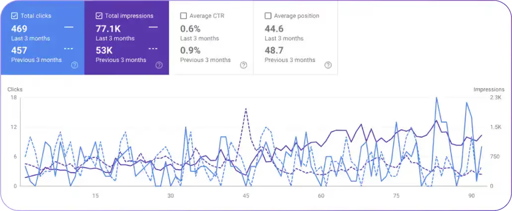
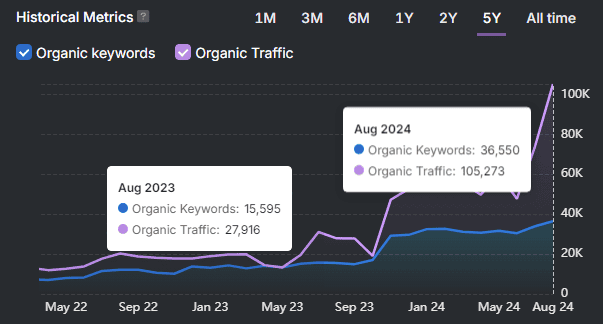
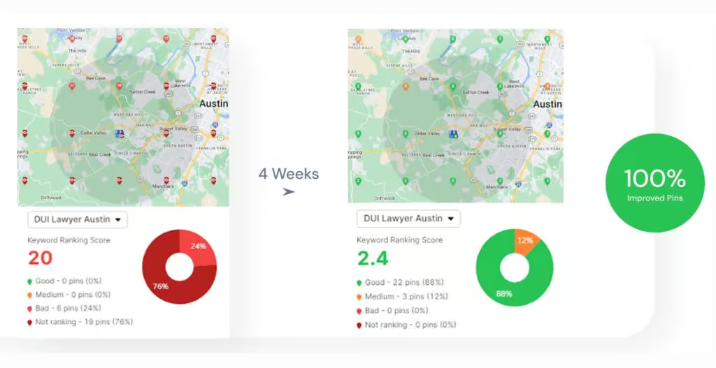
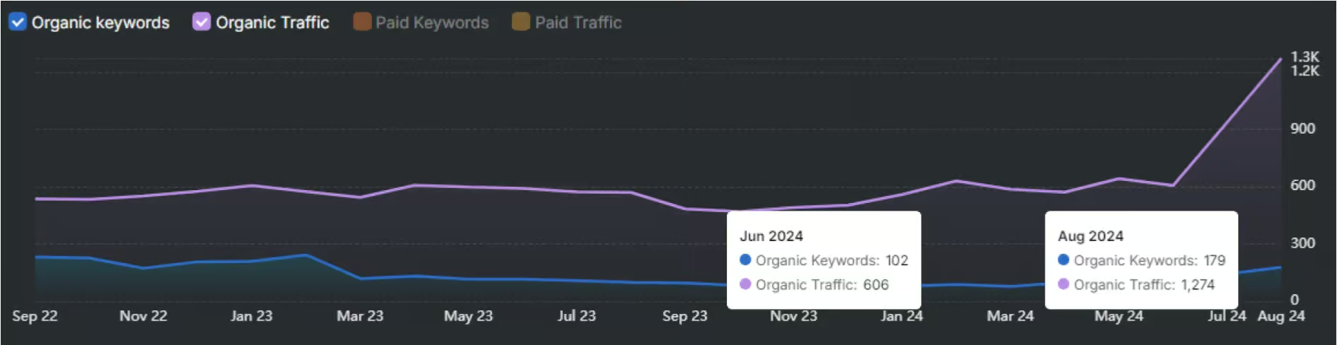
Many businesses have already transformed their digital presence by focusing on UX. Take, for example, a restaurant equipment supplier that saw a 390% increase in organic traffic after leveraging Search Atlas SEO tools to optimize their site structure, improve navigation, and enhance page performance
With Search Atlas, you have the tools to refine UX, track engagement, optimize load speed, and improve conversions, all while ensuring your site stays ahead of the competition.
Don’t let poor UX hold you back. Get a free trial today and see real results!