

Mobile SEO refers to the process of optimizing websites to perform seamlessly on mobile devices such as smartphones and tablets. Mobile SEO focuses on making sure that a site is fast, easy to navigate, and visually appealing on smaller screens while improving its ranking in mobile search results.
The importance of mobile SEO optimization lies in its ability to improve user experience, increase search engine visibility, and drive higher engagement and conversions from mobile users. Some of the mobile SEO best practices are ensuring mobile-first indexing, implementing responsive web design, optimizing mobile page speed, and simplifying navigation for touch screens. Considering these mobile SEO best practices contributes to a smoother and more effective mobile browsing experience.
What is Mobile SEO?
Mobile SEO is the practice of optimizing a website to make sure that it provides a seamless and user-friendly experience on mobile devices. Mobile SEO involves techniques and practices that help a website rank better in mobile search results on search engines. The core elements of mobile SEO are responsive web design, fast page speed, mobile-friendly content formatting, and proper use of mobile-specific meta tags and structured data.
Mobile search engine optimization has become increasingly critical as mobile searches now account for over 58% of all global web traffic. In addition, search engines like Google have implemented mobile-first indexing, meaning they primarily use the mobile version of a website’s content for indexing and ranking purposes. This fundamental shift makes mobile optimization not just beneficial but essential for maintaining search visibility.
Effective mobile SEO guarantees that a site loads quickly, is easy to navigate on smaller screens, and is accessible across various mobile devices. Success in mobile search optimization requires ongoing monitoring of mobile-specific metrics like mobile page speed, mobile usability errors, and mobile search rankings to guarantee optimal performance across all mobile devices.
What is Mobile SEO in the Overall SEO Strategy?
Mobile SEO serves as a core component within the overall SEO strategy rather than a separate discipline, fundamentally shaping how modern search optimization approaches are developed and implemented. Since Google adopted mobile-first indexing, mobile optimization has become the primary lens through which all SEO efforts must be viewed. This shift means that mobile user experience, page speed, and mobile-friendly design directly impact rankings across all devices, making mobile SEO essential for comprehensive search engine visibility. The technical requirements for mobile optimization now form the baseline standards for all SEO work.
Within the broader SEO framework, mobile SEO optimization influences every major component from content strategy to technical implementation and local search performance. Mobile user behavior patterns drive keyword research decisions, content formatting choices, and conversion optimization strategies that benefit overall search performance. The integration of mobile SEO considerations into link building, social media optimization, and user experience design creates a unified approach where mobile excellence improves desktop performance and vice versa.
Success in modern site SEO requires treating mobile optimization not as an add-on feature but as the foundation upon which all other SEO strategies are built. Treating mobile SEO as a foundation guarantees consistent performance and user satisfaction across all devices and search contexts.
What is the Importance of Mobile SEO?
Mobile SEO has become critically important because the majority of internet users today access websites through mobile devices. Studies such as the one by SOAX indicate that more than 60% of global web traffic comes from smartphones and tablets, making mobile optimization essential for reaching a significant number of internet users. Additionally, mobile SEO directly affects how a site performs in search engine rankings, especially since Google has made mobile optimization a priority through mobile-first indexing. This prioritization means that even desktop search rankings can be affected by how well a site performs on mobile devices.
Effective mobile SEO optimization significantly improves user experience. Mobile-optimized websites are easier to navigate, quicker to load, and more responsive to user interactions. These elements contribute to higher engagement, increased time-on-site, and better conversion rates. In fact, studies such as the one by Google show that 61% of users are unlikely to return to a site they had trouble accessing on mobile. Additionally, robust mobile SEO strategies contribute significantly to broader SEO goals by supporting areas like local SEO and voice search optimization.
Exceptional mobile SEO strategies and practices ultimately provide a competitive advantage by aligning your website with user expectations and search engine requirements. Businesses that invest in mobile SEO improve their rankings, build trust, increase user satisfaction, and position themselves for long-term digital success in an increasingly mobile-first world.
What Are the Most Important Mobile SEO Ranking Factors?

Mobile SEO ranking factors are specific elements that search engines like Google evaluate to determine how well a website performs in mobile search results. Understanding and optimizing for these mobile SEO ranking factors is essential to improve visibility, user experience, and overall search rankings. The most important mobile SEO ranking factors, according to Google, are listed below.
- Mobile-Friendliness. Mobile-friendliness refers to how well a website performs on smartphones and tablets. A mobile-friendly site uses responsive design, readable text, and easy navigation, which directly influences mobile search rank.
- Page Speed. Page speed refers to the time it takes for a webpage to fully load on a mobile device. Faster page speed improves user satisfaction and helps boost your mobile search rankings.
- Content Relevance. Content relevance refers to how closely your content matches a user’s search intent. Optimized and well-structured content improves visibility in mobile search ranking results.
- User Experience (UX). User experience on mobile involves intuitive navigation, accessible layouts, and quick interactions. Good mobile UX improves mobile friendliness and leads to higher engagement.
Optimizing for these mobile SEO ranking factors is essential for staying competitive in today’s mobile-first digital landscape. Focusing on these mobile SEO ranking factors helps websites improve their mobile search rankings and deliver a better experience to users on the go.
How to Do Mobile SEO?
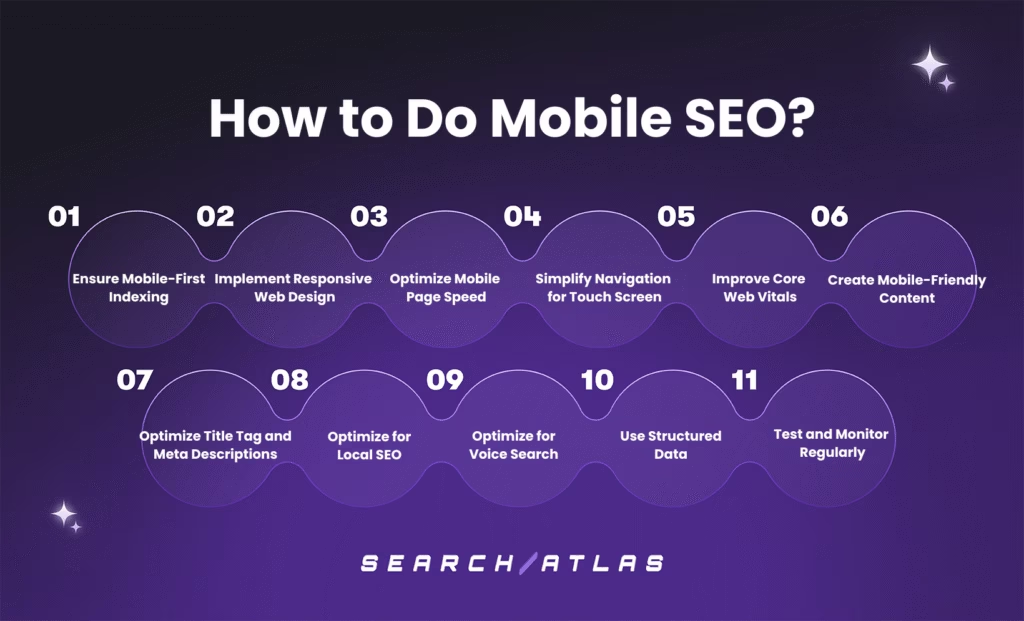
There are 11 ways to do SEO for mobile and facilitate your website to perform well on mobile devices. The 11 mobile SEO tips are outlined below.
1. Ensure Mobile First Indexing
Mobile-first indexing means that Google uses the mobile version of a website’s content for indexing and ranking purposes. Mobile-first indexing implies that Google’s algorithms predominantly consider how your site appears and performs on mobile devices when determining search rankings for all devices, including desktop searches.
Ensuring mobile-first indexing directly impacts search rankings across all devices, as Google primarily uses the mobile version of a site for indexing and ranking. Adopting mobile-first indexing boosts organic traffic, click-through rates, and user engagement metrics, as mobile-optimized sites load faster and offer smoother navigation. Additionally, optimizing for mobile-first indexing reduces bounce rates and increases conversion rates as it caters to the growing majority of users who browse and shop primarily on mobile devices.
To ensure mobile-first indexing, make sure your website layout adjusts fluidly across different screen sizes without separate URLs for mobile and desktop. Display the same primary content, metadata, structured data, and internal links on both versions. Optimize images, minify code, and leverage browser caching to meet Google’s mobile speed standards. Include identical title tags and meta descriptions on both desktop and mobile versions. Use large, clickable buttons and legible fonts, and eliminate intrusive pop-ups for a smooth mobile experience. Additionally, use Google Search Console to identify and fix mobile-specific issues promptly.
Ensuring mobile-first indexing is about delivering a consistent, high-quality experience that users expect. Implementing mobile-first indexing boosts both your SEO performance and user satisfaction on mobile devices.
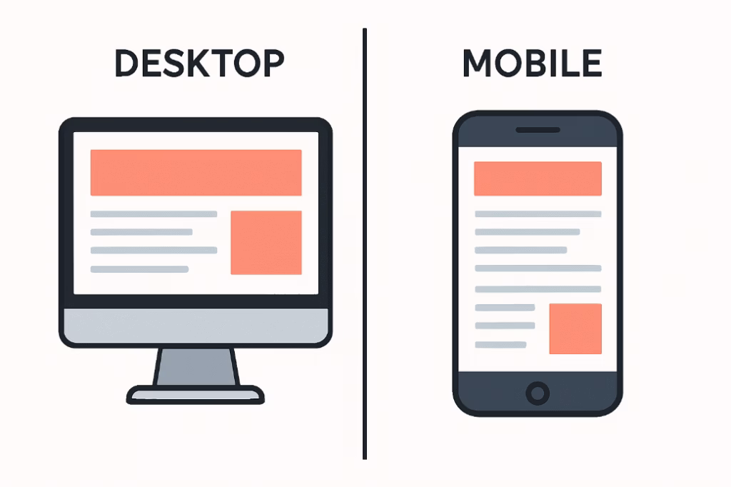
2. Implement Responsive Web Design
Responsive web design (RWD) is a web development approach that guarantees a website’s layout, images, text, and functionality automatically adjust to fit various screen sizes and devices. Responsive web design uses flexible grids, media queries, and fluid elements to deliver a seamless and consistent user experience, instead of creating separate sites for each device.
An example of a website with a responsive web design is given below.
Implementing responsive web design boosts mobile SEO performance by aligning with Google’s preferred mobile-first indexing and improving your site’s mobile search ranking. Incorporating responsive web design improves user experience by making sure visitors can navigate and interact with your site easily on any device. Adopting responsive web design saves crawling resources and improves crawl efficiency, as Googlebot only needs to crawl the page once. Additionally, applying responsive web design principles eliminates the need for redirection, which helps pages load faster and reduces potential errors.
To implement responsive web design, design your site using percentage-based widths rather than fixed units so elements resize proportionally across screen sizes. Use media queries to define breakpoints for different screen sizes and adjust the design accordingly. Use responsive image techniques (like max-width: 100%) and set video containers to scale correctly within mobile viewports. Design for smaller screens first, then scale up for larger devices to guarantee optimal usability on mobile.
Additionally, make text easy to read and buttons easy to tap on all screen sizes, especially for mobile friendliness SEO. Confirm that the content fits within the screen width on mobile devices to improve user experience and accessibility. Regularly test your responsive design on various devices.
Implementing responsive web design is foundational to successful mobile SEO. Embracing responsive web design guarantees your site is accessible and attractive on any device and aligns with Google’s best practices for mobile-first indexing, directly improving your site’s search performance and user satisfaction.
3. Optimize Mobile Page Speed
Optimizing mobile page speed refers to the process of improving how quickly a website loads and becomes usable on mobile devices. Optimizing mobile page speed improves mobile search rankings, as Google considers page speed a key ranking factor for mobile-first indexing. Improving mobile page speed reduces bounce rates and increases user satisfaction, leading to longer sessions and more engagement. Increasing mobile page speed boosts conversions, as faster sites make it easier for users to complete actions like filling out forms or making purchases. Additionally, boosting mobile page speed helps with crawl efficiency, allowing search engines to index more of your content during each visit.
The best practices for optimizing mobile page speed are mentioned below.
- Use Gzip or Brotli to reduce the size of your CSS, HTML, and JavaScript files.
- Minify CSS, JavaScript, and HTML files to remove unnecessary characters, comments, and whitespace.
- Compress images using modern formats like WebP and AVIF that provide better compression ratios than traditional JPEG and PNG formats.
- Implement lazy loading for images and videos that appear below the fold to reduce initial page load time.
- Reduce the number of redirects that add unnecessary loading time and HTTP requests.
- Implement browser caching to store frequently accessed resources locally on mobile devices.
- Use content delivery networks (CDN) to serve content from servers geographically closer to mobile users.
- Prioritize above-the-fold content loading to make sure users see important information immediately.
- Remove unused JavaScript and split large files to reduce load times.
- Use Google’s PageSpeed Insight to regularly check performance and follow Google’s recommendations for mobile optimization.
Optimizing mobile page speed is a core part of mobile SEO. Fast-loading mobile pages improve user experience and conversion rates as well as signal to search engines that your site is high quality and mobile-friendly.
4. Simplify Navigation for Touch Screen
Simplifying navigation for touch screens refers to the design approach of creating user-friendly navigation systems specifically optimized for finger-based interaction on mobile devices. Simplifying navigation for touch screens involves designing navigation elements, menus, buttons, and interactive components that are easily accessible, appropriately sized, and intuitively placed for touch-based browsing.
Simplifying navigation for touch screens improves mobile usability, making it easier for users to browse your site on smartphones and tablets. Optimizing navigation for touch screens supports better mobile search rankings, as Google prioritizes mobile-friendly design and accessibility. Adapting navigation for touch screens reduces user frustration, encouraging users to stay longer and engage more deeply with your content. Additionally, making navigation touch-friendly improves conversions, as users are more likely to complete desired actions when navigation is simple and intuitive.
The best practices for simplifying navigation for touch screens are outlined below.
- Design buttons and navigation links with a minimum size of 44×44 pixels to accommodate average finger tap areas.
- Limit main navigation items to 5-7 essential options to prevent overwhelming users with choices.
- Implement hamburger menus or collapsible navigation to maximize screen space while maintaining accessibility.
- Make the navigation bar sticky at the top so it stays visible and accessible as users scroll through the page.
- Use clear, descriptive text labels and familiar icons so users can intuitively understand where each link or button will take them.
- Avoid using hover-based dropdowns or menus, and make sure that all interactive elements work with a single tap.
- Add breadcrumb navigation where applicable to help users track their position and easily move back within the site structure.
- Minimize complex animations or transition effects that may slow down navigation or confuse users on slower devices.
Simplifying navigation for touch screens makes sure your mobile visitors can easily explore your website without confusion or frustration. Streamlining navigation for touch interactions is a critical part of creating a mobile-friendly SEO experience that drives engagement and improves rankings.
5. Improve Core Web Vitals
Core web vitals are a set of specific metrics that Google uses to measure user experience on websites, focusing on loading performance, interactivity, and visual stability. The three core web vitals are listed below.
- Largest Contentful Paint (LCP). The Largest Contentful Paint measures loading performance (should occur within 2.5 seconds).
- First Input Delay (FID). The First Input Delay measures interactivity (should be less than 100ms).
- Cumulative Layout Shift (CLS). The Cumulative Layout Shift measures visual stability (should be less than 0.1)
Improving core web vitals boosts mobile SEO performance, as these metrics are officially part of Google’s ranking criteria. Improving core web vitals improves mobile user experience, making your site faster, smoother, and more reliable to interact with. Optimizing core web vitals lowers bounce rates because users are more likely to stay on a site that loads quickly and responds promptly. Additionally, strengthening core web vitals increases engagement and conversions, as a fast, stable site encourages users to browse and take action.
To improve core web vitals, optimize images by compressing and using next-gen formats like WebP to improve loading time and reduce LCP. Minimize render-blocking JavaScript and CSS so that the page loads and becomes interactive faster. Use lazy loading for images and videos to prevent slowdowns caused by large media files loading all at once. Improve server response time by using a fast hosting service, caching, and efficient backend code.
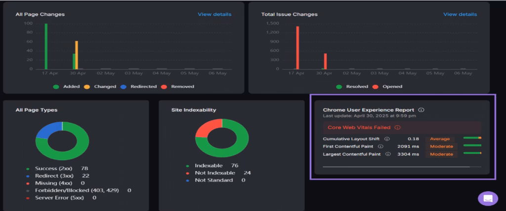
Additionally, avoid inserting dynamic content above existing content to reduce layout shifts and improve CLS. Use proper font-display strategies to prevent layout jank caused by web fonts loading late. Implement a content delivery network to serve content faster to users, regardless of their location. Regularly monitor your core web vitals in Google Search Console, PageSpeed Insights, or the Search Atlas Site Auditor Tool to identify and fix performance issues.
The Search Atlas Site Auditor Tool offers an in-depth overview of your site’s core web vitals and identifies bottlenecks affecting performance. Simply enter your domain and scroll down to the “Chrome User Experience Report.” You can click on each core web vital to view the pages that are performing well and those that need improvement. Additionally, the Search Atlas Site Auditor Tool offers actionable recommendations to help you optimize your site’s speed, responsiveness, and visual stability for a better user experience.
6. Create Mobile-Friendly Content
Creating mobile-friendly content means formatting and structuring your website’s text, images, and other media to be easily readable and engaging on mobile devices. Creating mobile-friendly content includes writing concise paragraphs, using readable fonts, optimizing media, and making sure all content adjusts well to smaller screens without requiring zooming or horizontal scrolling.
Developing mobile-friendly content improves your site’s mobile friendliness, making it more accessible and appealing to mobile users. Mobile-optimized content improves readability, which helps users quickly absorb information without effort or strain. Producing content tailored for mobile devices increases dwell time, as visitors are more likely to stay and engage with content that is easy to consume. Additionally, crafting mobile-optimized content supports better mobile search rankings, as Google favors websites that offer a smooth reading experience on all devices.
To create mobile-friendly content, keep paragraphs short with 2-3 sentences maximum to facilitate easy scanning and reduce visual overwhelm. Use larger font sizes with a minimum of 16px for body text to guarantee readability without zooming on mobile screens. Break up text with bullet points and numbered lists to improve readability and engagement. Incorporate white space effectively to avoid clutter and create a clean, breathable layout.
Additionally, use descriptive headings and subheadings (H1, H2, H3) to create a clear content hierarchy and enable quick scanning. Use responsive images and videos that resize automatically to fit different screen sizes. Avoid using pop-ups or intrusive interstitials that disrupt the mobile browsing experience. Make sure clickable elements like CTAs and links are finger-friendly and spaced out to prevent mis-clicks.
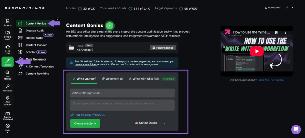
The Search Atlas Content Genius Tool is an innovative tool that helps you create high-quality, mobile-friendly content using Artificial Intelligence. Simply enter your topic, related keywords, and target country, and within minutes, the Search Atlas Content Genius Tool generates a high-quality, well-optimized article. You can click on the generated article to edit it and further improve its on-page SEO.
7. Optimize Title Tags and Meta Descriptions for Mobile SERPs
Optimizing title tags and meta descriptions for mobile SERPs means crafting concise, compelling, and keyword-rich titles and descriptions that display properly on mobile search engine results pages (SERPs). Optimizing title tags and meta descriptions for mobile SERPs improves mobile search visibility, helping users understand your content at a glance. Mobile-optimized title tags and meta descriptions improve click-through rates by encouraging mobile users to visit your site over others. Additionally, this optimization maximizes limited screen space, making sure your most important message appears clearly and completely.
The tips to optimize title tags and meta descriptions for mobile SERPs are given below.
- Keep title tags under 60 characters to prevent truncation and guarantee full visibility on mobile search results.
- Include primary keywords near the beginning of the title tag to catch attention quickly and align with search intent.
- Use clear, compelling language in meta descriptions under 105 characters so the full message appears on mobile without being cut off.
- Incorporate a strong call to action (CTA) in the meta description to encourage clicks (e.g., “Learn more,” “Get started today”).
- Avoid keyword stuffing and instead focus on natural, informative text that provides value to mobile users.
- Align titles and descriptions closely with the page content to maintain relevance and reduce bounce rates.
- Use unique titles and descriptions for each page to improve indexing and prevent content overlap in SERPs.
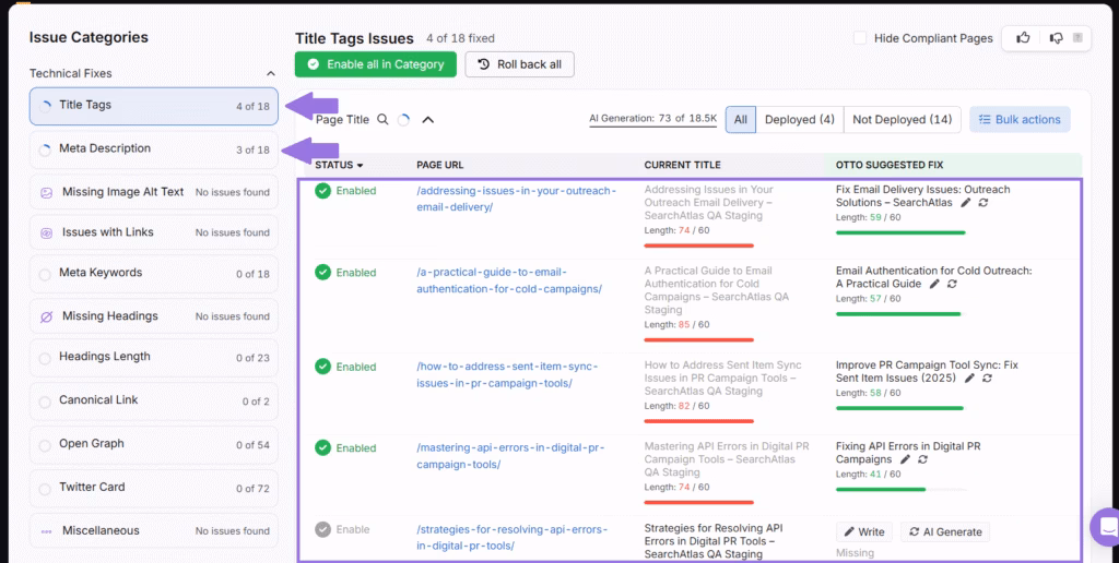
- Monitor and optimize your title tags and meta descriptions using tools like the Search Atlas OTTO SEO Tool.
The Search Atlas OTTO SEO Tool simplifies the process of optimizing title tags and meta descriptions by auditing your entire website and identifying areas for improvement. The Search Atlas OTTO SEO Tool provides AI-generated recommendations tailored to each page, suggesting the best-performing title tags and meta descriptions based on SEO best practices and keyword relevance. Simply click “Enable,” and the Search Atlas OTTO SEO Tool instantly applies the preferred suggestions to the live page, regardless of the content management system (CMS) you are using. This seamless integration not only saves time but makes sure your site’s metadata remains fully optimized for both mobile and desktop SERPs without the need for technical expertise.
8. Optimize for Local SEO
Optimizing for local SEO means tailoring your website and online presence to rank higher in location-based search results. The strategy targets users searching for services or businesses near their geographic area, making it especially crucial for brick-and-mortar stores, service providers, and location-dependent businesses.
Optimizing for local SEO helps your business appear in local map packs and geo-targeted search results, where most mobile users are looking. Improving your local search optimization strategy attracts nearby customers actively seeking your products or services, leading to more in-store visits or local service inquiries. Additionally, implementing local SEO strategies complements mobile SEO and enhances overall rankings, since mobile users often search with local intent.
To optimize for local search, claim and verify your Google Business Profile to make sure your business appears in local pack results and Google Maps listings. Use location-specific keywords throughout your content, including your city, region, or neighborhood, to increase local relevance. Ensure consistent NAP (Name, Address, Phone number) information across all online directories, citations, and your website. Include local schema markup to help search engines understand your business location and details. Additionally, create location-based landing pages if your business serves multiple areas to improve relevance in those local searches.
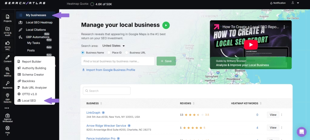
The Search Atlas SEO Software Platform offers a comprehensive set of tools designed to elevate your local SEO strategy. The Search Atlas Local SEO Heatmap Tool helps you uncover the most valuable location-based keywords for your business by visually highlighting which search terms are driving visibility in your target geographic areas. The Search Atlas GBP Optimization Tool provides clear, actionable recommendations to optimize your GBP and improve local rankings. Together, these tools streamline local SEO management and improve your visibility where it matters most.
9. Optimize for Voice Search
Optimizing for voice search involves tailoring your website content and SEO strategy to better align with the way people use voice commands on devices like smartphones, smart speakers, and virtual assistants (e.g., Siri, Google Assistant, Alexa). Optimizing for voice search helps increase your website’s visibility in spoken queries made through mobile devices and smart assistants like Google Assistant and Siri. The optimization allows you to capture high-intent, long-tail queries that can lead to higher engagement and conversions, since voice searches tend to be more conversational and often tied to local intent. Additionally, adopting voice search optimization improves user experience by aligning your content with natural speech patterns, making it easier for search engines to deliver your site as a relevant result.
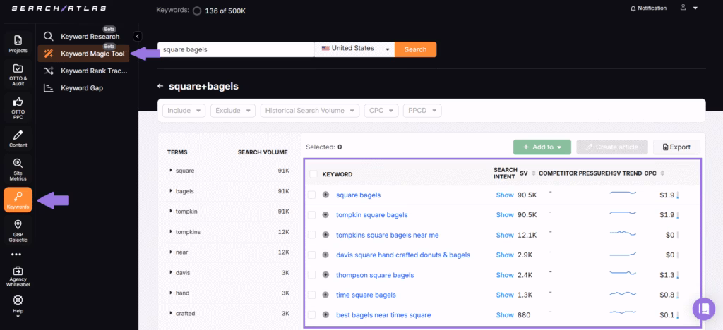
To optimize for voice search, write content in a natural, conversational tone to match how people speak when using voice commands. Use question-based keywords and phrases (e.g., “how,” “what,” “where”) that people typically ask via voice search. Create FAQ sections that answer common user queries clearly and concisely. Provide concise and direct answers within your content to increase the chances of being featured as a voice search result snippet. Additionally, leverage tools like the Search Atlas’s Keyword Magic Tool or Google’s “People Also Ask” to find long-tail, question-based phrases that reflect complete voice queries rather than short keyword phrases.
The Search Atlas Keyword Magic Tool serves as a powerful asset in discovering conversational and long-tail keywords commonly used in voice queries. Simply enter a seed keyword, select the country you want to target, and click search. The Search Atlas Keyword Magic Tool then generates a list of related keywords you can choose from, along with key metrics such as search intent, monthly search volume, traffic potential, keyword trend, and competitor pressure.
10. Use Structured Data
Structured data is a standardized format used to label and organize website content in a way that helps search engines better understand it. Structured data is typically implemented using schema.org vocabulary and JSON-LD format and provides context about elements like products, reviews, articles, events, and more.
Using structured data enables rich snippets and enhanced search result displays that make your mobile listings more visually appealing and informative, leading to higher click-through rates from mobile search results. An example of a rich snippet containing the recipe’s rating, time to make, and image is given below.

Using structured data improves mobile SEO performance by helping search engines better understand your content’s context and relevance, potentially leading to better rankings and increased visibility in mobile-specific search features. Additionally, mobile users benefit from structured data through more informative search results that help them make quicker decisions about which links to click, reducing their time spent browsing through multiple search results.
To use structured data, add schema markup to key pages like products, articles, FAQs, and reviews to increase visibility in mobile search results. Make sure that structured data is consistent across mobile and desktop versions of your site to align with mobile-first indexing standards. Use Google’s Rich Results Test tool to validate your structured data and confirm it is implemented correctly for mobile performance.
Additionally, avoid overusing or misusing schema types, which can lead to penalties or ineligibility for rich results. Keep the markup clean and lightweight, making sure it does not slow down your mobile site’s loading speed. Use JSON-LD format, as it is the preferred method by Google and is easy to implement without interfering with page structure. Update structured data regularly to reflect current business hours, offerings, and other dynamic content.
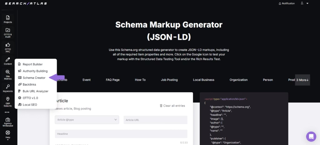
The Search Atlas Schema Markup Generator Tool helps you create accurate JSON-LD markups for your website, including all required and optional item properties. The Search Atlas Schema Markup Generator Tool is designed to streamline structured data implementation and help make sure your markup is aligned with Schema.org standards.
After implementation, the Search Atlas Schema Markup Generator Tool lets you easily test your generated markup using built-in links to Google’s Structured Data Testing Tool and Rich Results Test, making it simple to validate and optimize your content for improved search visibility.
11. Test and Monitor Regularly
Testing and monitoring regularly involves using tools and analytics to evaluate how well your website performs on mobile devices. Testing and monitoring regularly involves conducting periodic audits of mobile usability, page speed, search rankings, user experience metrics, and technical SEO elements to identify issues, opportunities for improvement, and changes in performance over time.
Regular testing and monitoring make sure your mobile SEO efforts remain effective by catching performance issues before they impact search rankings. Regular mobile SEO analysis helps maintain a seamless mobile user experience, reducing bounce rates and improving user engagement. Continuous monitoring keeps your site aligned with Google’s mobile-first indexing, making sure that your mobile content is always prioritized for crawling and ranking. Additionally, the practice supports continuous optimization, allowing you to adapt to algorithm changes, user behavior shifts, and emerging mobile technologies.
The best practices to test and monitor mobile SEO regularly are given below.
- Use Google Search Console regularly to check for mobile usability errors, indexing issues, and search performance on mobile devices.
- Perform mobile-friendly tests to make sure your site meets baseline mobile SEO standards.
- Audit core web vitals frequently to monitor metrics like loading speed, interactivity, and visual stability on mobile devices.
- Track mobile page speed with tools like PageSpeed Insights and implement recommended optimizations.
- Use tools like the Search Atlas Keyword Rank Tracker Tool to monitor mobile search rankings for target keywords and respond with targeted improvements.
- Use heatmaps and session recordings on mobile devices to understand how real users interact with your mobile site.
- Regularly test structured data and schema markup, making sure rich results are maintained and functioning properly on mobile SERPs.
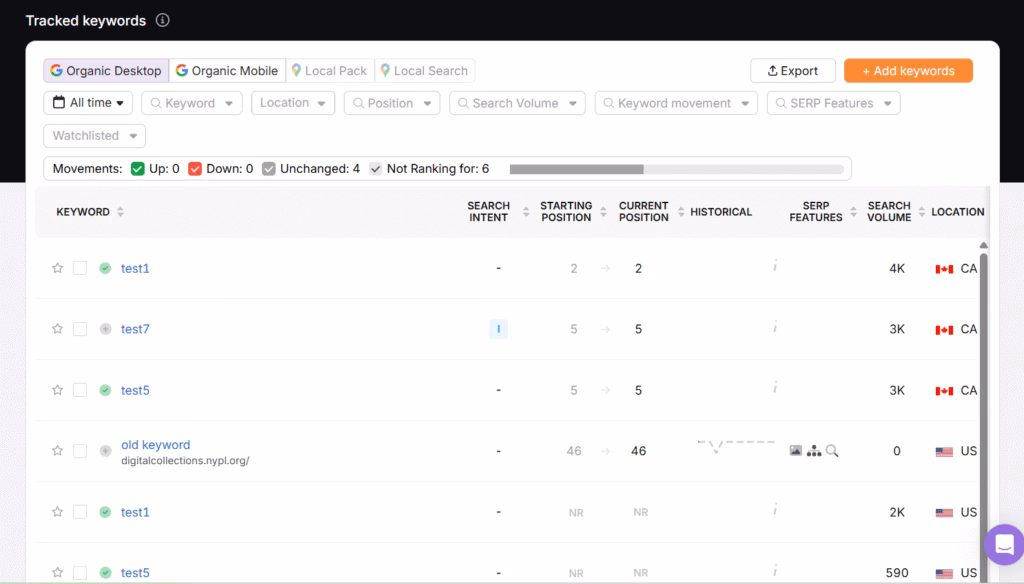
The Search Atlas Keyword Rank Tracker Tool works by continuously monitoring the positions of your target keywords in both desktop and mobile SERPs. Simply input the keywords you want to track, along with the domain or URL. You can customize the tracking by selecting specific locations to gather accurate local or global ranking data.
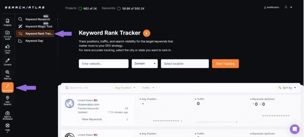
The Search Atlas Keyword Rank Tracker Tool then automatically checks the rankings at your chosen frequency, such as daily, weekly, or monthly, across both desktops and mobile devices. The Search Atlas Keyword Rank Tracker Tool provides insights into key metrics, including current position, search volume, SERP features, and ranking trends over time to help you evaluate your keyword performance, identify ranking gains or drops, and adjust your SEO strategy accordingly.

How to Do Mobile SEO Audit?
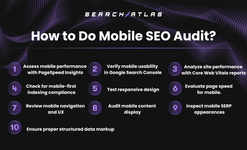
There are 10 steps involved in conducting a mobile SEO audit, each designed to evaluate how well your website performs on mobile devices and in mobile search results. The 10-step mobile SEO audit is given below.
- Assess mobile performance with PageSpeed Insights. Use Google PageSpeed Insights to analyze how your website performs, specifically on mobile devices. Pay close attention to metrics such as loading speed, time to interactivity, and visual stability.
- Verify mobile usability in Google Search Console. Navigate to the “Mobile Usability” report within Google Search Console to find specific errors affecting mobile performance, such as content wider than the screen or clickable elements too close together. Fixing these issues is crucial for maintaining strong rankings and user satisfaction.
- Analyze site performance with Core Web Vitals reports. Access Core Web Vitals data via Google Search Console or PageSpeed Insights to assess how well your mobile site performs in terms of user-centric metrics. Focus on mobile-specific measurements like Largest Contentful Paint, First Input Delay, and Cumulative Layout Shift, all of which directly influence mobile search visibility and user engagement.
- Check for mobile-first indexing compliance. Make sure that mobile and desktop content is identical, structured data is consistent, and meta tags are properly set up for mobile versions.
- Test responsive design. Use Chrome DevTools or mobile simulation tools to test your website’s responsiveness across various screen sizes and device types. The layout should adjust fluidly, making sure that menus, images, text, and buttons are appropriately scaled and easily accessible on all mobile devices.
- Evaluate page speed for mobile. Run your website through tools like GTmetrix, PageSpeed Insights, or WebPageTest to examine how quickly it loads over mobile networks. Slow load times hurt both user experience and rankings, so optimize images, leverage caching, and reduce unused scripts to improve mobile speed.
- Review mobile navigation and UX. Navigate your website using a mobile device to evaluate ease of use. Check for simplified menus, logical content flow, and touch-friendly buttons or CTAs. Mobile users should be able to find what they need quickly and without frustration to reduce bounce rates and boost conversions.
- Audit mobile content display. Confirm that all on-page content, including text, images, and interactive elements, renders correctly on mobile screens. The text should be large enough to read without zooming, images must scale responsively, and intrusive pop-ups should be avoided to maintain a smooth and engaging user experience.
- Inspect mobile SERP appearances. Search for your key pages on a mobile device or use a SERP preview tool to evaluate how your title tags and meta descriptions appear. Optimize these elements to be concise, relevant, and compelling enough to attract clicks, since mobile displays have limited space.
- Ensure proper structured data markup. Validate your structured data using Google’s Rich Results Test to confirm it is rendering properly on mobile and improving your search listings.
To conduct a mobile-friendly test, start by using a Mobile-Friendly Test tool. Simply enter your URL, and the tool will evaluate your website against key usability criteria for mobile devices.
The Mobile-Friendly Test tool will highlight specific issues such as small text, closely spaced links, or content that does not fit the screen, allowing you to make informed adjustments. Additionally, conducting manual checks across various devices and screen sizes can help you spot design or navigation issues that automated tools might miss.
Regularly conducting mobile-friendly checks helps you improve user satisfaction and align your website with Google’s mobile-first indexing approach, ultimately supporting your broader digital performance goals.
What Are the Best Mobile SEO Tools?
The best mobile SEO tools are Google’s free tools and the Search Atlas SEO Software Platform’s paid tools. Google offers several powerful and free tools that form the foundation of any mobile-first SEO strategy. Google Search Console is essential for monitoring mobile usability issues, indexing status, and core web vitals, three key factors that influence mobile search performance. Additionally, PageSpeed Insights provides detailed reports on mobile loading speed and suggestions to improve performance metrics like LCP, FID, and CLS. These free tools are user-friendly, data-rich, and directly tied to Google’s ranking systems, making them highly valuable for SEO professionals and site owners alike.
The Search Atlas SEO Software Platform, on the other hand, offers advanced mobile SEO capabilities that go beyond surface-level insights. The Search Atlas Site Auditor Tool gives a detailed overview of your site’s core web vitals and highlights performance issues affecting mobile speed, responsiveness, and visual stability. The Search Atlas Content Genius Tool uses AI to instantly generate mobile-friendly, SEO-optimized content based on your topic, keywords, and target country. Additionally, the Search Atlas OTTO SEO Tool audits your site and suggests AI-generated title tags and meta descriptions, which can be applied to your live website with just a click.
The Search Atlas Local SEO Heatmap Tool visually maps keyword visibility across geographic areas, helping improve your mobile local SEO strategy. The Search Atlas GBP Optimization Tool provides actionable recommendations to optimize your Google Business Profile for higher rankings in local mobile searches. The Search Atlas Keyword Magic Tool helps uncover long-tail and conversational keywords ideal for voice search, along with search volume, intent, and trend data. The Search Atlas Schema Markup Generator Tool simplifies the creation of structured data in JSON-LD format to support rich results on mobile SERPs. Additionally, the Search Atlas Keyword Rank Tracker Tool continuously monitors how your keywords rank in mobile and desktop SERPs, offering insights across locations.
Combining these free and paid mobile SEO tools allows you to cover all aspects of mobile SEO, from basic diagnostics to full-scale optimization, making sure your site performs well across all devices and stays competitive in mobile search results.
What is the Difference Between Mobile SEO and Desktop SEO?
The difference between mobile SEO and desktop SEO lies in the way websites are optimized to meet the specific needs, behaviors, and limitations of mobile versus desktop users.
Mobile SEO focuses on optimizing websites to deliver a seamless, fast, and user-friendly experience on smartphones and tablets. Mobile and tablet SEO involves responsive design, fast loading speeds, touch-friendly navigation, and optimizing for mobile-first indexing. The primary goal of mobile SEO is to make sure that users accessing the site via mobile devices can easily navigate, read, and interact with the content without zooming or scrolling excessively.
Desktop SEO, by contrast, is centered around optimizing websites for larger screens, where users typically have access to a keyboard, mouse, and more stable internet connections. Desktop SEO often focuses on in-depth blog posts, comprehensive navigation menus, and complex conversion paths that are more suitable for a desktop environment. The main goal of desktop SEO is to improve the desktop browsing experience through detailed content structures, high-resolution visuals, and navigation that suits mouse clicks and hover actions.
What is the Relation Between Mobile SEO and Image SEO?
Mobile SEO and image SEO are closely related because optimized images improve mobile page speed, increase user experience, and contribute to better mobile search rankings.
Mobile SEO refers to the practice of optimizing a website to make sure it performs well on mobile devices. Mobile focuses on factors like responsive SEO, fast loading times, mobile-friendly navigation, and content readability on smaller screens.
Image SEO, on the other hand, involves optimizing images so that search engines can properly index them and users can quickly load and interact with them. Image SEO includes compressing image file sizes, using descriptive alt text, adopting responsive image formats, and guaranteeing fast loading. Effective image SEO supports faster mobile performance, boosts accessibility, and improves visual content for users browsing on smartphones and tablets.
What is the Relation Between Mobile SEO and AMP Pages?
Mobile SEO and AMP (Accelerated Mobile Pages) are closely connected because AMP pages are designed to improve mobile page speed and user experience, which are key ranking factors in mobile SEO.
Mobile SEO is the process of optimizing your website to make sure it performs well on mobile devices. Mobile SEO aims to provide a smooth and accessible browsing experience for mobile users while improving search visibility in mobile-specific results.
AMP Pages, on the other hand, are lightweight, stripped-down versions of web pages created using the AMP framework developed by Google. AMP pages are designed to load almost instantly on mobile devices by limiting the use of JavaScript and using a streamlined version of HTML. Effective AMP pages improve mobile performance, reduce bounce rates, and can help websites appear in prominent placements like Google’s Top Stories carousel on mobile search, aligning directly with mobile SEO goals.
What to Know About Mobile SEO Besides Page Speed SEO?
Mobile SEO focuses on delivering an optimal browsing experience for users accessing your website from smartphones and tablets. Mobile SEO involves making sure your site is mobile-responsive, touch-friendly, quick to load, and easy to navigate on smaller screens. The key components of mobile SEO are mobile-friendly content formatting, intuitive navigation, optimized images, and compatibility with mobile-first indexing.
Page speed SEO, on the other hand, focuses on improving how fast your website loads and becomes interactive, especially on mobile devices. Fast-loading pages are essential for retaining visitors and satisfying Google’s ranking criteria. Additionally, improving page speed reduces bounce rates and improves engagement and conversion rates.
While page speed SEO is a critical part of mobile SEO, it is only one element, and successful mobile optimization requires a broader approach that includes usability, design, and content strategy tailored for mobile users.
Does Core Web Vitals Affect Mobile SEO?
Yes, core web vitals do affect mobile SEO. Google uses core web vitals as part of its page experience signals for mobile ranking. This prioritization means that mobile sites scoring poorly in these metrics can experience lower rankings in mobile search results. Optimizing core web vitals makes sure that your mobile site is fast, responsive, and stable, all of which contribute to better search visibility, user engagement, and conversion rates on mobile.
What is the Difference Between Mobile SEO and Mobile App SEO?
The difference between mobile SEO and mobile app SEO is that mobile SEO focuses on optimizing websites for mobile browsers, while mobile app SEO centers on improving the visibility of mobile applications in app stores and search engines.
Mobile SEO is the process of tailoring a website’s design, content, and technical elements specifically to deliver an optimal experience for users accessing it via smartphones and tablets.
Mobile app SEO, on the other hand, focuses on increasing the discoverability of a mobile app both within app stores like Google Play and Apple App Store, as well as in mobile search results. Mobile app store SEO involves optimizing elements such as the app title, description, keywords, and reviews. The goal of mobile app SEO is to boost app downloads and visibility.


