AI retention measures the percentage of users who continue paying for and engaging with an AI product after their initial signup month. Cohort analysis applies this measurement to discrete groups organized by acquisition period, tracks each group independently over time, and produces patterns that aggregate retention rates conceal. The resulting data distinguishes early enthusiasm churn from workflow adoption curves and genuine product dissatisfaction in ways that single-metric dashboards cannot.
AI SaaS cohort retention differs structurally from traditional SaaS retention because AI products attract a disproportionate share of trial-driven users who explore new capabilities without committing to sustained use. These users inflate M0 user counts and exit before M3, creating characteristic early-period cliff patterns that newer teams mistake for fundamental product failure. Distinguishing tourist churn from product-driven churn requires cohort-level visibility that aggregate dashboards cannot provide.
The metrics at the center of AI SaaS cohort retention are gross revenue retention (GRR), net revenue retention (NRR), and user retention by cohort month, each measured from M0 through M12 and beyond for mature cohorts. GRR measures whether existing revenue is retained without accounting for expansion. NRR measures whether revenue grows from within the existing base. User retention by cohort month isolates the behavioral signals that precede revenue changes.
The M3 milestone functions as the primary predictive checkpoint in AI SaaS retention curves. Users who remain active at M3 have typically completed initial exploration, integrated the product into at least one recurring workflow, and crossed the activation threshold that separates exploratory usage from committed use. M3 retention predicts long-term cohort performance with greater accuracy than any earlier measurement point because the tourist churn pool has largely exited by month three.
What Is AI SaaS Cohort Retention?
AI SaaS cohort retention is the measurement of how many users or paying accounts from a specific acquisition period remain active over sequential months. Cohort retention groups users by their signup month and tracks that group independently from other acquisition periods. The measurement produces a retention matrix where rows represent acquisition cohorts and columns represent months of activity from M0 through M12 or beyond.
How does cohort retention differ from overall retention rates? Cohort retention isolates performance by acquisition period, while overall retention averages all active users together. Overall retention rates mask the performance of individual signup periods. A product with deteriorating new-cohort retention shows no signal in aggregate metrics if earlier, better-retained cohorts remain active and large. Cohort retention exposes this lag immediately because each cohort’s curve stands independently.
What does a cohort retention matrix contain? A cohort retention matrix contains one row per acquisition cohort and one column per activity month. The cell at row M and column N contains the percentage of cohort M’s original users who remained active in month N. Month 0 for each cohort always reads 100% because all users in the cohort were active at signup. Values decrease from left to right as users exit at each subsequent month.
Why does AI SaaS cohort retention require a specific definition separate from standard SaaS cohort analysis? AI SaaS cohort retention requires a separate definition because AI products experience distinct early-phase churn patterns driven by exploratory behavior that traditional SaaS models do not exhibit. Traditional SaaS products attract buyers who have evaluated a specific business need and committed purchase intent. AI products attract a broader initial audience, including users who explore the product out of curiosity rather than a committed need. This exploratory audience exits faster and in greater volume during M0 through M3, creating a characteristic shape that alters what baseline retention numbers mean.
What data inputs build an AI SaaS cohort retention measurement? AI SaaS cohort retention requires three data inputs: sign-up date, activity events, and billing status for each user. The sign-up date assigns the user to a cohort. Activity events define what counts as retention (logins, feature usage, API calls, document creation). Billing status confirms whether the user remains a paying account or has churned. The combination of all three inputs produces a retention measurement that reflects both engagement and revenue commitment.
Why Cohort Analysis Matters for AI-Native Products?
Cohort analysis matters for AI-native products because aggregate metrics collapse the distinct behavioral phases that define AI product adoption into a single undifferentiated number. AI product adoption follows a phased pattern (initial curiosity, exploration, workflow integration, and committed use). Each phase produces different retention signals. Aggregate metrics combine all phases, making it impossible to distinguish a product with strong workflow-integrated users from a product with high signup rates and rapid churn.
What signal does cohort analysis reveal that aggregate analysis cannot? Cohort analysis reveals the timing and magnitude of each churn wave separately for every acquisition period. The M0 to M1 drop reveals the percentage of users who never returned after signing up. The M1 to M3 drop reveals the tourist phase exit rate. The M3 to M6 drop reveals the secondary churn wave, which reflects users who integrated the product superficially without building workflow dependency. Each wave points to a different intervention.
How does cohort analysis change how AI product teams read retention data? Cohort analysis changes retention data interpretation by adding a time dimension and acquisition context to every metric. A 40% M3 retention rate reads differently for a January cohort versus a September cohort for the same product. January cohorts at early-stage AI products often show lower retention because the product itself was less mature. September cohorts from the same product, post-iteration, show 55% M3 retention in improved versions. Without cohort separation, both numbers collapse into a single average that reveals nothing about the improvement trajectory.
What business decisions depend on cohort retention data for AI products? Pricing model design, onboarding investment decisions, and expansion timing decisions all depend on cohort retention data. A product with strong M3 retention and flat M6 to M12 curves justifies higher acquisition spend because the retained base remains stable. A product with continuing churn past M6 signals that pricing or feature gaps push even committed users out before the full contract period. Cohort data makes each of these patterns visible before they compound into revenue problems.
Which Retention Metrics Matter Most for AI SaaS Companies?
There are four main retention metrics for AI SaaS companies. Each metric captures a different dimension of product health and predicts a different business outcome. The metrics are listed below.
- Gross revenue retention (GRR).
- Net revenue retention (NRR).
- User retention by cohort month.
- Feature activation rate.
What does gross revenue retention measure for AI SaaS companies? Gross revenue retention measures the percentage of recurring revenue retained from an existing customer cohort before expansion revenue is added. GRR reflects pure retention without the benefit of upsells, seat additions, or tier upgrades. For AI SaaS, GRR is the foundational metric because it exposes base churn unmasked by expansion. A product with 75% GRR loses 25% of its contracted revenue from an existing cohort each period from pure churn and downgrades.
What does net revenue retention reveal that GRR cannot? Net revenue retention reveals whether the product’s existing user base grows revenue through expansion, seat additions, or tier upgrades above the churn baseline. NRR above 100% means the existing customer base generates more revenue than it did in the prior period, despite any churn. NRR above 120% is characteristic of AI products with strong workflow integration and multi-team adoption patterns. NRR below 100% means churn exceeds expansion, which signals product or market fit problems regardless of new customer acquisition rates.
What does user retention by cohort month measure that revenue metrics cannot? User retention by cohort month measures the behavioral health of specific acquisition periods independent of revenue size. Revenue metrics capture financial outcomes after the fact. User cohort retention captures behavioral signals earlier. A declining M3 user retention rate for recent cohorts predicts a GRR decline two to three months before that decline appears in revenue data. This predictive advantage makes user cohort retention the most actionable leading indicator available to AI SaaS operators.
What does feature activation rate measure in the context of cohort retention? Feature activation rate measures the percentage of users in a cohort who complete a defined set of actions that predict long-term retention. For AI SaaS products, activation typically includes: completing the onboarding flow, running the core feature at least three times in the first week, and generating at least one output that the user saves or shares. Users who complete activation criteria retain at substantially higher rates than users who do not. Tracking activation rate by cohort connects onboarding behavior to downstream retention performance.
What Makes AI SaaS Cohort Retention Different From Traditional SaaS?
AI SaaS cohort retention differs from traditional SaaS retention in three structural ways. They are the composition of the initial cohort, the steepness of the early-period drop-off, and the relationship between workflow integration and long-term retention. Traditional SaaS attracts evaluated buyers. AI SaaS attracts explorers alongside buyers. The difference in initial cohort composition produces systematically lower M1 and M3 retention figures that are not interpreted using traditional SaaS benchmarks. The table below compares the two models across the primary retention dimensions.
| Dimension | Traditional SaaS | AI SaaS |
| M0 cohort composition | Mostly evaluated buyers | Buyers plus explorers |
| M1 retention range | 70% to 85% | 45% to 65% |
| M3 retention range | 55% to 75% | 30% to 55% |
| Primary churn driver | Feature gaps, pricing | Tourist exits, activation failure |
| Workflow integration signal | Contracts and seat counts | Feature adoption depth |
| Long-term stabilization | M3 to M6 | M3 to M4 |
The AI Tourist Effect and Early User Churn
The AI tourist effect is the systematic overrepresentation of exploratory, non-committed users in the M0 cohort of AI SaaS products. AI tourists sign up out of curiosity or in response to media attention rather than an identified business need. These users inflate the initial cohort size and exit within M0 to M3 at rates that far exceed committed buyer churn rates. The tourist effect produces the characteristic early-period drop that appears in AI SaaS cohort charts.
How does the AI tourist population enter an AI SaaS product’s cohort? AI tourists enter cohorts through viral media cycles, social sharing, and free trial offers that reduce signup friction below the evaluation threshold. Traditional SaaS signup flows require identifying a business problem, comparing alternatives, and committing to a trial with specific intent. AI SaaS signup flows, particularly those with freemium tiers or immediate output generation, attract users who complete a signup without completing an evaluation. The reduced friction that makes AI products grow quickly fills cohorts with users who exit in the first billing period.
What proportion of an AI SaaS M0 cohort consists of tourists? The tourist proportion of a new AI SaaS cohort varies by product category, pricing model, and distribution channel, but commonly ranges from 30% to 60% of initial signups for horizontal AI tools. Vertical AI tools with specific use cases (legal document review, medical coding, engineering code generation) attract narrower audiences and exhibit lower tourist proportions. Horizontal AI writing, image generation, or general productivity tools attract broader exploratory audiences and exhibit higher tourist proportions.
What signals identify tourist churn as distinct from product-driven churn? Tourist churn exhibits three behavioral signals: absence of activation completion, low feature depth usage, and exit before or immediately after the first billing event. Users who churn before completing the defined activation threshold are overwhelmingly tourists. Users who complete activation but still churn at M1 represent a different problem, typically a disconnect between what the activation flow delivered and what the user’s actual workflow required.
Why AI Products Experience Steeper M0-M3 Drop-Offs?
AI products experience steeper M0 to M3 drop-offs because the combination of novelty-driven signup, low-friction access, and output-without-commitment design patterns fills initial cohorts with users who have no workflow need for the product. A traditional project management tool acquires users who have a project management problem. An AI writing tool acquires users who range from professional content teams to individuals who tried it once out of curiosity. The second population produces a drop-off that is architectural, not correctable through feature changes alone.
How does the freemium pricing model amplify tourist churn in early cohorts? Freemium pricing amplifies tourist churn by removing the financial commitment that historically filtered non-serious buyers from SaaS cohorts. The barrier to signing up drops to the level of a social media registration. The resulting cohort contains a substantially higher fraction of exploratory users than a product with even a minimal paid trial. Freemium cohorts show steeper M0 to M1 drops than paid trial cohorts for the same product.
What role does the onboarding experience play in M0 to M3 retention for AI products? The onboarding experience determines what fraction of the non-tourist cohort survives the M0 to M3 period by guiding users to the activation events that build workflow dependency. Users who reach activation retain at substantially higher rates. Users who do not reach activation are indistinguishable in the retention chart from tourists, even when their exit is driven by onboarding failure rather than lack of intent. Improving onboarding converts some apparent tourist churn into retained users.
Why Early Cohort Performance Can Be Misleading?
Early cohort performance at M0 and M1 is misleading because it reflects the tourist pool’s behavior rather than the true buyer population’s behavior. A product that reports 80% M0 activity and 55% M1 retention appears to be performing within normal SaaS ranges. The same product that tracks feature activation separately finds that 65% of M0 users never completed the activation flow, meaning only 35% of the M0 cohort was ever a genuine retention candidate. Measuring retention against the total M0 count produces metrics that obscure the real buyer base size.
How does cohort size growth distort early retention metrics? Rapid cohort size growth from a viral event or media cycle distorts early retention metrics by inflating the M0 denominator without changing the absolute number of retained users. A product retaining 500 committed users from a 1,000-user January cohort shows 50% M3 retention. The same product retaining 500 committed users from a 5,000-user February cohort (after viral coverage) shows only 10% M3 retention. The absolute retained population is identical. The retention rate appears catastrophically different because the tourist-inflated denominator for February was five times larger.
What is the correct interpretation of the M0 cohort size for AI products? M0 cohort size is a signal of acquisition channel breadth and distribution reach, not a signal of qualified buyer demand. Teams that model long-term revenue projections from M0 size without adjusting for tourist exit rates overestimate the retained population and underestimate the churn problem. The correct base for revenue modeling is the activation-complete population, not total M0 signups.
How Does Workflow Integration Change Long-Term Retention?
Workflow integration changes long-term retention by converting occasional users into habitual users whose productivity depends on the product remaining active. A user who runs an AI tool once per week as an experiment retains it only when the experiment continues to produce novel outcomes. A user who has integrated the tool into a daily task that cannot be completed without it retains it because the cost of switching exceeds the benefit of switching. The shift from experimental to integrated use is the primary driver of M3 to M12 retention stability.
What actions indicate that a user has achieved workflow integration? Workflow integration is indicated by three behavioral markers: recurring usage patterns, multi-feature adoption depth, and output reuse. Recurring usage patterns mean the user accesses the product on a predictable schedule tied to their work calendar. Multi-feature adoption depth means the user has engaged with two or more core features, not just the initial discovery feature. Output reuse means the user retrieves and builds on previous AI outputs rather than generating isolated one-off outputs. Each marker independently predicts higher M6 and M12 retention.
How do teams measure workflow integration progress within early cohorts? Teams measure workflow integration progress by tracking the percentage of M1 users who meet all three behavioral markers before the end of month two. Firstly, identify users who have achieved recurring usage by the end of M1. Secondly, segment those users by multi-feature adoption depth. Thirdly, measure their M3 and M6 retention against the base cohort rate. The gap between workflow-integrated users and non-integrated users quantifies the value of onboarding investment that drives users toward integration.
At what month does workflow integration become visible in cohort data? Workflow integration becomes visible in cohort data at M2 to M3, when the retention curve of integration-complete users separates from the retention curve of integration-incomplete users. Before M2, both populations show similar short-term activity. After M3, the integrated population remains at rates that exceed the non-integrated population by 20 to 40 percentage points. This separation point is why M3 functions as the primary predictive milestone in AI SaaS retention analysis.
What Does a Healthy AI SaaS Retention Curve Look Like in 2025-2026?
A healthy AI SaaS retention curve from 2025 to 2026 shows a steep M0 to M3 drop followed by a stable flat tail from M3 through M12. The steep early drop reflects tourist churn and is expected for any AI product with broad distribution or freemium access. The flat tail from M3 onward reflects the workflow-integrated user base that has converted from exploratory to habitual use. The depth of the flat tail, meaning the percentage retained at M3 and maintained through M12, determines whether the product has sufficient revenue foundation to grow.
What specific curve shape distinguishes a healthy AI product from a struggling one? A healthy AI SaaS retention curve reaches a stabilization point at M3 or M4 and then decreases by less than 5 percentage points per month from that stabilization point through M12. A struggling product shows continued steep decline past M3, often losing 8 to 15 percentage points per month through M6, indicating that even workflow-integrated users are churning. The difference between a stabilizing and a declining curve determines the long-term GRR trajectory.
How do newer AI product categories differ from established ones in their expected curve shape? Newer AI product categories show wider variance in retention curves than established categories because user expectations, workflow templates, and comparison benchmarks are not yet standardized. An AI legal contract analysis tool operates in a well-defined professional workflow with established expectations. An AI ambient meeting transcription tool operates in a newer workflow where user expectations are still forming. Newer categories accept lower M3 retention benchmarks because the committed user base is still defining what sustainable use looks like for that product type.
What M3 retention percentages distinguish healthy AI SaaS products in 2025 to 2026? M3 retention above 35% for horizontal AI tools and above 50% for vertical AI tools indicates a healthy product with a retained workflow-integrated user base. Horizontal tools (AI writing, AI research, AI image generation) serve broad audiences with high tourist proportions and achieve lower absolute retention percentages while maintaining commercially viable retained bases. Vertical tools (AI coding assistants, AI medical documentation, AI legal research) serve narrower audiences with higher baseline intent and achieve higher M3 retention because the tourist fraction is smaller.
What Is the M3 Milestone in AI SaaS Retention?
The M3 milestone is the measurement of retention at month three after initial signup, which is the earliest point at which the tourist churn pool has largely exited, and the remaining cohort reflects the genuine workflow-integrated user base. M3 retention is the primary predictive checkpoint for long-term cohort performance because users who remain at M3 have demonstrated sustained engagement beyond initial curiosity. The M3 rate is the most reliable single data point for forecasting a cohort’s M12 revenue contribution.
Why is M3 the primary predictive checkpoint rather than M1 or M6? M3 is the primary checkpoint because M1 still contains a significant fraction of the tourist population in the exit process, while M6 provides useful validation but arrives too late for timely product intervention. M1 retention reflects the first billing event for most monthly subscription products. At M1, tourists who explored during a free trial period are just beginning to make payment decisions. Many tourist exits occur between M1 and M3. By M3, the cohort has passed through the initial billing cycle, the free-to-paid conversion decision, and the first workflow integration period.
What Strong M3 Retention Signals About Product Value?
Strong M3 retention signals that the product has successfully converted a meaningful fraction of its initial cohort from exploratory users into workflow-dependent users. Workflow dependency means the user has embedded the product into at least one recurring work process where its absence would require substitution or manual effort. The M3 rate reflects how many users reached this dependency state within the first three months.
What secondary signals accompany strong M3 retention in healthy AI products? Strong M3 retention accompanies high activation rates, multi-feature adoption depth, and positive qualitative feedback on specific use cases. A product with 50% M3 retention and low activation rate completion suggests that many retained users stumbled into workflow integration through product quality alone, which is a fragile foundation. A product with 50% M3 retention and high activation completion suggests that the onboarding systematically converts explorers into integrated users, which is a scalable and improvable outcome.
How does strong M3 retention affect long-term revenue forecasting? Strong M3 retention allows revenue teams to forecast M12 cohort contribution with significantly higher accuracy because the M3 to M12 decay rate for a stable cohort is substantially lower and more predictable than the M0 to M3 decay rate. M3 retention at 45% with a monthly decay rate of 2% from M3 onward produces an M12 retention estimate of approximately 37%. This predictability supports investment decisions, pricing model design, and team capacity planning.
When Does Weak M3 Retention Indicate a Product Problem?
Weak M3 retention indicates a product problem when it falls significantly below category benchmarks AND is accompanied by low activation completion rates for users who attempted the core workflow. Low M3 retention alone reflects a high tourist proportion from a specific acquisition channel, which is a distribution problem rather than a product problem. Low M3 retention combined with low activation completion in users who tried the core feature signals that the product failed to deliver expected value to committed users.
How do teams distinguish a tourist composition problem from a product problem at M3? Teams distinguish tourist composition problems from product problems by measuring M3 retention separately for activation-complete users and activation-incomplete users. Activation-complete users retain at acceptable rates (above category benchmarks), but total M3 retention is low because the activation completion rate is low. The problem is onboarding design, not product value. Activation-complete users retain the following category benchmarks.
What product signals correlate with weak M3 retention beyond the activation data? Weak M3 retention correlates with support ticket volume around specific feature failures, negative qualitative feedback on output quality, and high single-session usage patterns among churned users. Single-session users who sign up, generate one output, and never return represent a specific failure mode where the product delivered a one-time curiosity satisfaction but failed to reveal a recurring use case. This pattern appears in products where the core feature is novel but not deep enough to generate a repeating need.
How M3 Retention Predicts Long-Term Cohort Performance?
M3 retention predicts long-term cohort performance because the users who remain at M3 are structurally different from the users who exited before M3. M3 survivors have demonstrated willingness to pay through at least two billing cycles, have completed or nearly completed the initial workflow integration period, and have encountered the product’s limitations and chosen to remain. These characteristics predict lower monthly churn rates from M3 through M12 than any cohort-level average would suggest.
What three-step process applies M3 retention to long-term forecasting? There are three main steps for applying M3 retention data to long-term cohort forecasting. The steps are listed below.
- Calculate the M3 retention rate for each cohort in the analysis window.
- Calculate the monthly decay rate from M3 to M6 for cohorts with sufficient age.
- Apply the observed M3 to M6 decay rate to the M3 retention figure to forecast the M12 cohort value.
This three-step framework produces M12 estimates that consistently outperform extrapolations based on M1 or full-cohort average decay rates.
Why does M3 explain more M12 variance than M1 or M2 retention? M3 explains more M12 variance than M1 or M2 retention because M3 isolates the post-tourist population, whose churn rate is structurally lower and more stable. M1 retention includes a significant fraction of mid-tourist-exit users whose churn between M1 and M3 adds unpredictable variance to M12 projections. The M3 cohort has cleared that variance source.
How do product teams act on M3 retention data to influence long-term outcomes? Product teams act on M3 retention data by identifying the activation patterns that predict M3 survival and investing in onboarding improvements that drive more users through those patterns. The intervention point is M0 to M2, when users who would otherwise be tourist-exists are still in the product. Identifying the specific actions that separate M3 survivors from M3 churners and designing the onboarding flow to guide users toward those actions is the highest-leverage retention improvement available.
How to Compare AI SaaS Cohorts Over Time?
Teams compare AI SaaS cohorts over time by aligning each cohort’s retention curve on the M0 axis and plotting multiple cohorts on the same chart. This alignment allows direct visual comparison of M1, M3, M6, and M12 retention rates across cohorts from different acquisition periods. An upward shift in the retention curve from one cohort to the next indicates that later-acquired users retain better than earlier-acquired users. A downward shift indicates deterioration.
What does a cohort vintage comparison reveal about product improvement? A cohort vintage comparison reveals whether product changes, pricing modifications, or onboarding investments have produced measurable improvements in the retention of successively acquired user cohorts. A product team that shipped a major onboarding improvement in March tested whether the April cohort’s M3 retention exceeds the March cohort’s M3 retention. The vintage comparison converts anecdotal product development timelines into measurable retention outcomes.
How many cohorts are required for a meaningful vintage comparison? A meaningful vintage comparison requires at least four consecutive monthly cohorts of similar size. Fewer than four cohorts provide insufficient pattern data to distinguish a trend from a single cohort anomaly. Cohorts of significantly different sizes require normalization before comparison because absolute retained user counts do not produce comparable retention percentages.
What is the standard format for a cohort vintage comparison table? The standard format is a matrix with cohorts in rows, ordered by acquisition month, and activity months in columns from M0 to M12. Each cell contains the percentage of the original cohort retained at that month. Color coding from red (low retention) to green (high retention) makes the pattern immediately visible across multiple cohorts. Downward trends in any column signal deterioration in that activity-month performance across successive cohorts.
How to Separate Product Improvements From Seasonal Effects?
Teams separate product improvements from seasonal effects by comparing cohort performance from the same calendar month across different years and by controlling for known seasonal acquisition patterns. Seasonal effects produce similar retention patterns across the same calendar period in multiple years. Product improvements produce step-change improvements that do not correlate with the calendar period.
What three steps produce a seasonally controlled cohort comparison? There are three main steps for controlling seasonal effects in cohort vintage comparisons. The steps are listed below.
- Identify the calendar months with known seasonal acquisition variability (Q1 new-year sign-ups, Q3 summer slowdowns).
- Compare each month’s cohort retention across at least two years to establish the seasonal baseline.
- Measure any deviation from the seasonal baseline for post-improvement cohorts.
Deviations above the seasonal baseline indicate genuine product improvement. Deviations that match the seasonal baseline indicate apparent improvement is seasonal, not product-driven.
What acquisition channel data helps distinguish seasonal from product-driven changes? Acquisition channel data distinguishes seasonal effects by identifying whether cohort composition shifted alongside the retention change. A cohort that shows improved M3 retention AND changed acquisition channel composition (more paid search versus viral) has improved because it attracted a higher-intent buyer mix, not because the product improved. Controlling for acquisition channels prevents misattributing channel mix shifts to product quality improvements.
Are Newer AI SaaS Cohorts Retaining Better Than Older Cohorts?
Yes, newer AI SaaS cohorts are generally retaining better than cohorts from 18 to 24 months earlier, across the AI SaaS category. The improvement reflects two converging trends. AI products have matured their onboarding and workflow integration guidance as the category has developed, and the buyer market has become more educated about AI product selection, reducing the proportion of tourism-driven signups relative to intent-driven signups. Earlier cohorts from 2022 to 2023 reflected a market where AI novelty drove massive exploratory signups with very low committed buyer fractions. Cohorts from 2025 onward reflect a more mature market where signups reflect more intentional evaluation.
Does this improvement apply equally across AI product categories? The retention improvement does not apply equally across all AI product categories. Vertical AI tools (legal, medical, engineering) showed faster retention maturation because their user bases were professional buyers from the start, with limited tourist populations. Horizontal AI tools (writing, research, image generation) showed slower retention maturation because they continued attracting large tourist populations through broad consumer marketing and viral distribution. The gap between vertical and horizontal AI cohort performance has narrowed but has not closed.
What Cohort Shapes Reveal About Product-Market Fit?
Cohort shapes reveal the degree and type of product-market fit through the pattern of their M0 to M12 retention curves. There are four main cohort shapes in AI SaaS retention analysis. Each shape maps to a distinct product-market fit scenario. The shapes are listed below.
- The Cliff Pattern.
- The Stabilizing Curve.
- Flat Retention Curves.
- Consistent Cohort Improvement.
1. The Cliff Pattern
The Cliff Pattern indicates a product that has found its committed buyer base but acquires a large tourist population alongside it. The Cliff Pattern shows a steep drop from M0 through M2 or M3, followed by a relatively flat retention tail from M3 through M12. The steepness of the cliff reflects the tourist proportion. The height of the flat tail reflects the size of the committed buyer base.
What does the Cliff Pattern’s flat tail height indicate? The flat tail height in the Cliff Pattern indicates the proportion of each cohort that consists of genuine workflow-integrated buyers. A product with a cliff dropping to 35% and then holding flat through M12 has achieved product-market fit for 35% of its acquired users. The flat tail is stable, which means the product delivers sustained value to its retained base. The cliff is correctable through acquisition channel refinement and onboarding improvement.
What is the commercial implication of a Cliff Pattern for an AI SaaS product? The commercial implication of the Cliff Pattern is that GRR is suppressed below what the product’s genuine buyer retention would suggest. The 65% of each cohort that exits before M3 suppresses GRR as if they were product failures. Recalculating GRR on the activation-complete population reveals the true buyer GRR, which is typically substantially higher. The Cliff Pattern product has a product-market fit story that it cannot tell with aggregate metrics.
2. The Stabilizing Curve
The Stabilizing Curve indicates a product that is still finding its committed buyer definition. The Stabilizing Curve shows a moderate early decline followed by a continued gradual decline through M6 or M12 without a clear flat tail. The absence of a flat tail means that even users who survived the tourist exit phase are continuing to churn at a rate above what a workflow-integrated user base would show. The curve stabilizes eventually, but at a lower absolute level than expected, and without the decisive inflection point that the Cliff Pattern shows.
What causes the Stabilizing Curve rather than the Cliff Pattern? The Stabilizing Curve appears when the product has partial workflow integration for some users but full workflow integration for fewer. Users who integrated one feature into one workflow retain through M3 but churn at M6 when the workflow evolves, or a competitor offers a more complete solution. True Cliff Pattern products have integrated multiple features into multiple workflows, creating switching cost depth that the Stabilizing Curve product has not yet achieved.
What interventions address a Stabilizing Curve? The primary interventions for a Stabilizing Curve are feature depth investment and workflow integration guidance. Feature depth investment means extending the product’s capability in the workflows where early retention is strong. Workflow integration guidance means creating content, in-product prompts, and customer success touchpoints that guide M3 survivors toward multi-feature adoption before M6. The goal is to convert the gradual decline of the Stabilizing Curve into the flat tail of the Cliff Pattern.
3. Flat Retention Curves
Flat Retention Curves from M0 through M12 indicate a product that has achieved deep workflow integration for its entire acquired cohort. Flat curves are rare and typically appear in vertical AI tools with narrow, high-intent buyer audiences and no significant tourist population. The flat curve means every acquired user completed activation, integrated the product into a recurring workflow, and remained throughout the measurement period. This is the highest signal of product-market fit available in cohort retention data.
What distinguishes genuine Flat Retention Curves from measurement artifacts? Genuine Flat Retention Curves are distinguished from measurement artifacts by their persistence across multiple successive cohorts. A single cohort with flat retention reflects a sampling anomaly, a small cohort where absolute numbers mask underlying churn, or a cohort acquired from an unusually high-intent channel. Flat curves that repeat across four or more successive cohorts from diverse acquisition channels indicate genuine product-market fit rather than a one-time measurement outcome.
What are the growth implications of Flat Retention Curves? Flat Retention Curves support aggressive acquisition investment because the acquired user base remains substantially intact through the measurement period. LTV to CAC calculations produce their most favorable ratios for flat-curve products because the denominator (churn) is minimized. Products with flat curves from M0 through M12 have achieved the foundation for expansion-led growth, where NRR from existing cohorts drives a substantial fraction of total revenue growth.
4. Consistent Cohort Improvement
Consistent Cohort Improvement indicates a product that is actively finding product-market fit through iteration. The shape appears in vintage comparisons rather than individual curves. Each successive cohort retains better than the prior one at every measurement month. The January cohort shows better M3 retention than the December cohort. The February cohort shows better M3 retention than the January cohort. The pattern confirms that product or onboarding improvements are having measurable effects on the retained buyer base.
What is the minimum improvement threshold that constitutes Consistent Cohort Improvement? A minimum improvement of 3 to 5 percentage points in M3 retention across three consecutive cohorts constitutes meaningful Consistent Cohort Improvement. Smaller improvements fall within the statistical noise of cohort size variation. Larger improvements often reflect a single major intervention (a pricing change, a product launch, an acquisition channel shift) rather than sustained product development progress.
What does Consistent Cohort Improvement signal to investors and strategic decision-makers? Consistent Cohort Improvement signals that the product development process is translating into commercially measurable retention gains. Investment decisions in early-stage AI products frequently hinge on whether the team demonstrates that its iteration process improves retention outcomes. A vintage comparison showing consistent M3 improvement across six successive cohorts demonstrates this capability more concretely than any roadmap projection.
How to Distinguish Tourist Churn From Product Dissatisfaction?
Teams distinguish tourist churn from product dissatisfaction by measuring four behavioral dimensions. There are four main behavioral categories for distinguishing tourists from product-driven churn. The categories are listed below.
- Behavioral Signals of Tourist Churn.
- Behavioral Signals of Product Dissatisfaction.
- Feature Adoption Patterns Across Cohorts.
- Activation Metrics and Retention Correlation.
1. Behavioral Signals of Tourist Churn
Behavioral signals of tourist churn are patterns that indicate a user never formed a genuine use case for the product. Tourist churn signals include. No activation event completion, single-session engagement across the full tenure, zero output saves or exports, and exit immediately preceding or following the first billing event. Each signal individually provides weak evidence. Three or more signals together identify the user as a tourist exit with high probability.
Why does activation completion absence distinguish tourist churn from product dissatisfaction? Activation completion absence distinguishes tourist churn because product-dissatisfied users typically complete activation before discovering the product’s limitations. A user who churned without completing onboarding never encountered the core feature’s output quality. Dissatisfaction requires encountering the product’s value proposition, finding it insufficient, and choosing to exit. Tourists exit before this encounter occurs.
What usage depth metrics identify tourist churn in platform analytics? Feature breadth below two features accessed, total session time below 20 minutes across the full tenure, and output count below three generated items are the primary usage depth metrics identifying tourist behavior. Each metric reflects a user who interacted with the product surface without engaging with its depth. Committed users consistently show broader feature access, longer total session time, and higher output generation counts within the first 30 days.
2. Behavioral Signals of Product Dissatisfaction
Behavioral signals of product dissatisfaction are patterns that indicate a user engaged with the product deeply enough to evaluate it and found it insufficient for their workflow. Product dissatisfaction signals include: activation completion followed by churn, high feature usage depth followed by a sudden engagement drop, support ticket submission before exit, and comparative evaluation activity (accessing competitor pages or viewing comparison content) in the days before cancellation.
How does support ticket submission before the exit signal product dissatisfaction? Support ticket submission before exit signals product dissatisfaction because it represents an active attempt to resolve a product problem before abandoning the product. A tourist does not submit support tickets. A tourist exits when interest fades. A dissatisfied user submits tickets when the product fails to meet a specific workflow requirement, and the user is still invested enough to request resolution. Support ticket volume in the M1 to M3 window, measured for users who subsequently churned, identifies the workflow failures driving product dissatisfaction churn.
What exit survey data confirms product dissatisfaction versus tourist churn? Exit survey responses citing specific feature limitations, output quality gaps, or workflow integration failures confirm product dissatisfaction. Exit survey responses citing “just exploring” or “no longer need this” without specific product references confirm tourist exits. The language precision of exit survey responses is the most direct signal. Product teams that instrument exit surveys for cancelling users and categorize responses into tourist versus product-failure buckets generate the most actionable retention improvement data.
3. Feature Adoption Patterns Across Cohorts
Feature adoption patterns across cohorts are the rates at which each cohort’s users engage with individual product features at each month of activity. Tracking feature adoption by cohort reveals whether new features are being adopted by existing users, whether core features are losing engagement over time, and whether the features associated with high M3 retention are being reached by enough users in recent cohorts.
How do feature adoption patterns predict which cohorts will retain best? Feature adoption patterns predict cohort retention by identifying which feature combinations correlate with M3 and M12 survival in historical cohorts. A retrospective analysis of cohorts with high M3 retention reveals which features high-retaining users adopted in M0 and M1. These features become the target outcomes for onboarding optimization in current cohorts. Tracking current cohort feature adoption against the historical high-retention patterns reveals whether each new cohort is on track for high M3 performance before M3 arrives.
What is the most common feature adoption pattern in high-retaining AI SaaS cohorts? The most common feature adoption pattern in high-retaining AI SaaS cohorts is a progression from the primary discovery feature to at least one secondary feature within M1. Users who use only the primary feature plateau quickly and churn at M2 to M3 when novelty fades. Users who extend into a secondary feature within M1 build a usage pattern that creates multiple points of workflow dependency. This multi-feature dependency is the most reliable predictor of M3 survival across AI product categories.
4. Activation Metrics and Retention Correlation
Activation metrics and retention correlation are the statistical relationships between the completion of defined onboarding actions and the probability of M3 and M12 survival for each cohort. Activation metrics are the specific user actions that a product team designates as evidence of initial value delivery (completing a workflow template, generating a saved output, or integrating an external data source). Retention correlation is the measured difference in M3 survival rates between activation-complete and activation-incomplete users.
How do teams calculate activation-to-retention correlation? Teams calculate activation-to-retention correlation by splitting each cohort into activation-complete and activation-incomplete populations and measuring M3 retention separately for each group. The ratio between the two M3 rates is the correlation coefficient in practical terms. A product where activation-complete users retain at 55% and activation-incomplete users retain at 15% has a strong activation-to-retention correlation. The activation flow is the primary lever for improving overall cohort M3 retention.
What activation metric design principles produce the strongest retention correlations? Activation metric designs that require the user to complete a workflow delivering immediate specific value to their use case produce the strongest retention correlations. Generic onboarding flows that walk users through feature menus without connecting features to the user’s specific job produce weak activation-to-retention correlations because completion does not indicate value recognition. Personalized onboarding flows that connect features to stated use cases produce completion events that genuinely correlate with subsequent retention.
What Retention Benchmarks Matter Most for AI SaaS Companies?
There are four main retention benchmarks for AI SaaS companies. Each benchmark operates on a different dimension of product health. The benchmarks are listed below.
- Gross Revenue Retention Benchmarks.
- Net Revenue Retention Benchmarks.
- User Retention Benchmarks by Cohort Month.
- Retention Benchmarks by AI Product Category.
1. Gross Revenue Retention Benchmarks
Gross revenue retention benchmarks matter most because GRR is the foundational metric that reveals whether an AI SaaS product’s existing customer base is shrinking before expansion is accounted for. GRR benchmarks for AI SaaS vary by product category and pricing model, but establish the minimum threshold for commercial viability. A product with GRR below category benchmarks is losing its existing revenue base faster than the category median, which constrains growth regardless of new customer acquisition rates.
What GRR benchmarks apply to AI SaaS products in 2025 to 2026? Top-quartile AI SaaS products achieve GRR above 85%, while category-median products achieve GRR in the 70% to 80% range. Vertical AI tools with professional workflow integration achieve higher GRR because buyer intent is higher and switching cost is greater. Horizontal AI tools with consumer or SMB audiences achieve lower GRR because the tourist proportion is larger and switching cost is lower. GRR below 70% in any AI category indicates a structural retention problem that acquisition alone cannot resolve.
How does GRR benchmark interpretation differ for freemium versus paid AI SaaS? GRR benchmark interpretation differs for freemium versus paid AI products because freemium GRR calculations exclude free-tier users, who are not revenue-generating. Freemium GRR is calculated on paid-conversion cohorts only. A freemium product with strong paid-tier GRR above 80% and weak free-to-paid conversion has a different problem profile than a paid product with weak GRR. The metric applies to the same population in both cases (paying customers), but the freemium product’s free user retention is a separate measurement with different benchmarks.
2. Net Revenue Retention Benchmarks
Net revenue retention benchmarks matter most for AI SaaS because NRR above 100% indicates that the existing customer base is self-funding growth through expansion, reducing dependence on new customer acquisition. For AI SaaS products with high initial acquisition costs, NRR above 100% is the primary indicator of sustainable unit economics. Products with NRR above 120% grow their existing customer revenue faster than they lose it to churn, which produces expansion-led growth at scale.
What NRR benchmarks apply to AI SaaS companies in 2025 to 2026? Best-in-class AI SaaS products achieve NRR above 120%, category-median products achieve NRR between 95% and 110%, and products below 90% NRR face structural unit economics challenges. NRR above 120% requires not only strong GRR but meaningful expansion within the existing customer base through seat additions, tier upgrades, or usage-based billing growth. Workflow-integrated AI tools with multi-team adoption patterns are the most common source of above-120% NRR.
How do usage-based pricing models affect NRR benchmarks for AI SaaS? Usage-based pricing models produce higher NRR variance than seat-based pricing models because revenue expands or contracts with usage volume. A usage-based AI API product with growing customer usage automatically generates NRR above 100% without explicit upsells. The same product with declining customer usage generates NRR below 100% automatically. NRR benchmarks for usage-based products reflect different dynamics than seat-based benchmarks, and direct comparisons require accounting for the pricing model difference.
3. User Retention Benchmarks by Cohort Month
User retention benchmarks by cohort month matter most because they reveal the behavioral health of each acquisition period before revenue changes become visible. Revenue metrics lag behavioral metrics by one to three months in subscription businesses because churn affects the next billing cycle. User cohort retention metrics capture declining engagement in the current month, providing the earliest available signal of emerging GRR deterioration.
What user retention benchmarks by cohort month apply to AI SaaS in 2025 to 2026? M1 retention benchmarks range from 50% to 70% for horizontal AI tools and 65% to 80% for vertical AI tools. M3 retention benchmarks range from 30% to 50% for horizontal AI tools and 45% to 65% for vertical AI tools. M12 retention benchmarks range from 20% to 35% for horizontal AI tools and 35% to 55% for vertical AI tools. Products achieving the upper end of each range have demonstrated strong tourist-to-buyer conversion and workflow integration effectiveness.
How do M1 and M3 benchmarks relate to long-term cohort performance? M1 and M3 benchmarks function as predictive checkpoints where early above-benchmark performance reliably predicts above-benchmark M12 performance, and below-benchmark early performance predicts below-benchmark M12 performance. The predictive relationship is stronger at M3 than at M1 because M3 has cleared the tourist phase and isolated the committed user population.
4. Retention Benchmarks by AI Product Category
Retention benchmarks by AI product category matter most because cross-category comparison of retention metrics produces misleading conclusions about product health. An AI coding assistant and an AI image generation tool serve different buyer profiles with different workflow integration depths and different tourist proportions. Comparing their M3 retention rates directly produces false equivalences. Category-specific benchmarks provide the correct comparison baseline.
What are the primary AI product categories and their benchmark retention profiles? There are five main AI product categories with distinct retention profiles: AI coding assistants, AI content creation tools, AI research and analytics tools, AI workflow automation tools, and AI communication tools. The categories and their benchmark M3 retention ranges are listed below.
- AI coding assistants. M3 retention 55% to 75%.
- AI content creation tools. M3 retention 30% to 50%.
- AI research and analytics tools. M3 retention 40% to 60%.
- AI workflow automation tools. M3 retention 50% to 70%.
- AI communication tools. M3 retention 35% to 55%.
Why do AI coding assistants achieve the highest M3 retention among major categories? AI coding assistants achieve the highest M3 retention because their user base consists almost exclusively of professional buyers with specific workflow needs and high switching costs. A developer who integrates an AI coding assistant into their daily development environment faces significant reconfiguration costs. The professional workflow context reduces tourist proportions and increases workflow dependency depth compared to general productivity AI tools.
What Tools Do AI SaaS Companies Use for Cohort Retention Analysis?
There are three main categories of tools for AI SaaS cohort retention analysis. Each category serves a distinct analytical function in the retention measurement stack. The categories are listed below.
- Product analytics platforms (Mixpanel, Amplitude, Heap).
- Business intelligence tools (Looker, Metabase, Mode).
- Integrated marketing analytics platforms (Search Atlas, Google Analytics 4, Segment).
What do product analytics platforms provide for cohort retention analysis? Product analytics platforms provide event-level tracking of user behavior within the product, enabling cohort construction based on any combination of user events, not just signup date. Mixpanel’s retention analysis feature builds cohorts from any event pair (first event defines cohort entry, second event defines retention measure). Amplitude’s cohort comparison feature overlays multiple cohorts on a single chart for vintage comparison. Heap automatically captures all user interactions without requiring manual instrumentation, making retroactive cohort construction possible for events that were not pre-defined as tracking points.
What do business intelligence tools provide for cohort retention analysis? Business intelligence tools provide flexible data modeling that connects product event data with billing data and user attribute data for multi-dimensional cohort analysis. Looker builds cohort retention queries from raw event tables stored in data warehouses, enabling custom retention definitions based on billing records, product usage, and user segment data simultaneously. Metabase provides SQL-based cohort analysis accessible to non-engineering teams. Mode supports collaborative analytics notebooks where cohort analysis code is documented alongside visualizations.
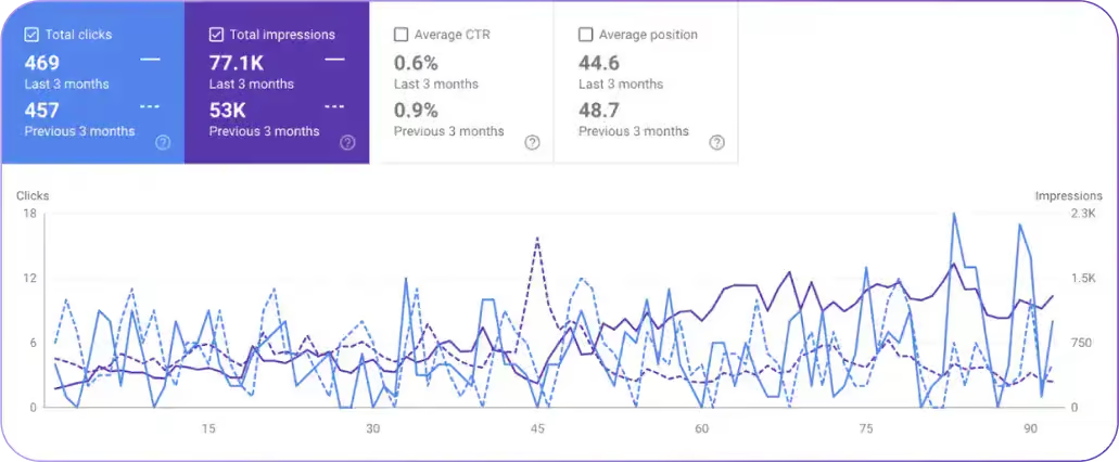
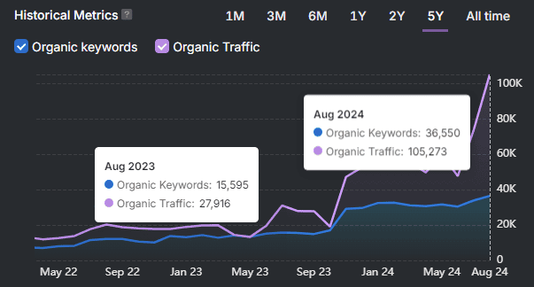
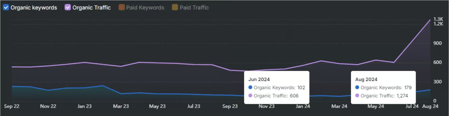
What does Search Atlas provide for AI SaaS marketing analytics related to cohort performance? Search Atlas pr****ovides an integrated analytics environment through its Report Builder and GSC Performance tool that tracks organic acquisition cohort performance over sequential months. The Report Builder connects GA4 and Google Search Console data, enabling marketing teams to segment organic acquisition by month and compare how traffic cohorts from different campaign periods engage with content over time. The GSC Performance tool tracks keyword-driven acquisition trends month over month, providing the search channel data that sits at the top of the AI SaaS funnel and feeds into cohort construction for organic channels. Search Atlas consolidates the GA4 and GSC data layers that marketing teams use to measure how organic content strategies drive qualified cohort acquisition.
What does Google Analytics 4 contribute to cohort retention analysis? Google Analytics 4 contributes a native Cohort Exploration report that tracks user retention by acquisition week or month across any user-level metric. GA4’s Cohort Exploration builds cohort matrices directly from the GA4 interface without requiring external tooling. The report tracks retention by session, event, or user engagement metrics. For AI SaaS teams using GA4 as their primary analytics layer, the Cohort Exploration report provides the foundational M0 to M12 cohort view without requiring a separate product analytics platform.
What does Segment contribute to cohort retention analysis? Segment contributes a customer data platform layer that standardizes user event data from multiple sources into a single schema before routing it to analytics platforms. Without Segment or a comparable CDP, cohort construction requires reconciling event data from the product, billing events from the payment processor, and user attribute data from the CRM manually. Segment automates this reconciliation, ensuring that cohort definitions use consistent user identity across all data sources.
How to Run AI Cohort Retention Analysis in Search Atlas?
Teams run cohort retention analysis in Search Atlas by using the Report Builder’s GA4 and GSC integrations to segment organic acquisition traffic by month, compare engagement metrics across acquisition cohorts, and track how content-driven acquisition periods perform over time. There are six main workflow steps for running cohort retention analysis in Search Atlas. The steps are listed below.
- Build Cohorts by Signup Month.
- Compare Cohort Vintages Over Time.
- Visualize M0 to M12 Retention Curves.
- Identify Tourist Churn Patterns.
- Benchmark M3 Retention Against Industry Medians.
- Create a Monthly Cohort Review Process.
How to Build Cohorts by Signup Month?
Teams build cohorts by signup month in Search Atlas by connecting GA4 to the Report Builder, then filtering the user acquisition report by first session month to define each cohort’s entry period. The GA4 connection in Search Atlas pulls acquisition data, including first session date, traffic source, campaign, and user engagement metrics. Filtering by the first session month groups users into monthly acquisition cohorts that track through subsequent engagement periods.
What data connection is required to build signup-month cohorts in Search Atlas? The GA4 integration in Search Atlas’s Report Builder is required to pull acquisition and engagement data for cohort construction. Once connected, the Report Builder accesses GA4’s user acquisition data, which includes acquisition date fields that define cohort membership. The connection pulls channel-level data that segments each cohort by the traffic source that acquired them, enabling channel-level cohort comparison.
How does the GSC Performance tool in Search Atlas contribute to cohort building? The GSC Performance tool contributes keyword-level acquisition data that identifies which search queries drove each monthly cohort’s initial visits. For AI SaaS teams tracking organic acquisition, keyword-level cohort data reveals whether cohorts acquired through branded queries retain differently from cohorts acquired through category queries. Branded-query cohorts typically have higher intent and show better M3 retention than category-query cohorts, and the GSC Performance tool makes this channel-cohort distinction visible.
How to Compare Cohort Vintages Over Time?
Teams compare cohort vintages in Search Atlas by creating a Report Builder dashboard that plots engagement metrics for each monthly cohort across the same time axis. The Report Builder’s date range controls allow setting a fixed start date for each cohort and measuring engagement through the same subsequent period length. Overlaying three to six monthly cohorts on the same chart reveals whether engagement for organic acquisition cohorts is improving, declining, or stable across successive acquisition periods.
What metrics does Search Atlas’s Report Builder track for vintage comparison? The Report Builder tracks traffic, keyword performance, and engagement signals drawn from GA4 and GSC for each cohort period. These metrics serve as proxies for the behavioral retention signals that product analytics platforms track at the feature-usage level. Organic cohorts with higher engagement in M2 and M3 retain more deeply in their content consumption patterns, which correlates with higher downstream product trial conversion and product-level retention.
How does the Report Builder’s white-label export capability extend vintage comparison workflows? The Report Builder‘s white-label export capability delivers formatted vintage comparison reports to stakeholders and clients without requiring direct platform access. Scheduled delivery generates monthly cohort comparison reports automatically and distributes them on a defined cadence. For agency teams tracking cohort performance across multiple client accounts, the automated delivery eliminates manual report assembly for each client’s organic acquisition cohort review.
How to Visualize M0-M12 Retention Curves?
Teams visualize M0 to M12 retention curves in Search Atlas by building a custom Report Builder report that tracks monthly engagement metrics for each acquisition cohort from its month of acquisition through twelve subsequent months. The visualization output is a line chart with one curve per acquisition cohort, with the x-axis representing months since acquisition and the y-axis representing the engagement metric (sessions, engaged sessions, or conversions). Each curve’s shape reveals the retention pattern for that cohort.
What GA4 data fields support M0 to M12 curve visualization in the Report Builder? The user acquisition date field, session date field, and session engagement metrics in GA4 support M0 to M12 curve visualization. These fields allow the Report Builder to calculate, for each user in each cohort, how many months have elapsed since their first session and what their engagement level is in each subsequent month. The aggregated output by cohort and month-since-acquisition produces the retention matrix that underlies each cohort’s curve.
How does the Portfolio Summary in Search Atlas extend retention curve monitoring across multiple accounts? The Portfolio Summary monitors organic traffic health scores, week-over-week changes, and performance category assignments across all connected accounts simultaneously. For agencies managing multiple AI SaaS clients, the Portfolio Summary surfaces which client accounts show declining M2 or M3 engagement trends before they appear in revenue data. Accounts categorized as “At Risk” in the Portfolio Summary are the first candidates for deeper cohort curve analysis.
How to Identify Tourist Churn Patterns?
Teams identify tourist churn patterns in Search Atlas by examining which acquisition cohorts show high M0 engagement followed by minimal M1 and M2 engagement in the Report Builder’s cohort comparison dashboards. Tourist churn produces a specific signature in the engagement metrics. A sharp M0 count followed by a large absolute drop at M1, with the remaining M2 through M12 engagement remaining relatively flat. Cohorts acquired through broad viral or paid social channels typically show this pattern more strongly than cohorts from organic search or referral channels.
What channel data from Search Atlas helps isolate tourist acquisition patterns? GSC Performance data within Search Atlas identifies which keyword categories drove the highest M0 engagement with the lowest subsequent session return rate. Keywords with high click volume and low return session rates generate tourist visits. Content pages ranked for those keywords attract users who satisfy their curiosity in one session and do not return. Identifying these pages and adjusting their content strategy to attract higher-intent visitors reduces the tourist proportion in future cohorts.
How does the Site Auditor in Search Atlas complement tourist churn identification? The Site Auditor identifies the technical issues on content pages that prevent users from reaching the product content that would qualify them as genuine prospects. Pages with slow load times (flagged via Core Web Vitals data), broken internal link chains, redirect chains, and orphaned URLs create friction that causes curious visitors to exit before encountering the product value proposition. Fixing these issues improves the structural quality of pages that sit at the top of the acquisition funnel.
How to Benchmark M3 Retention Against Industry Medians?
Teams benchmark M3 organic retention against industry medians by comparing the engagement rate at M3 for each cohort against the baseline engagement rate established from the cohort’s M0 month. The percentage retained at M3 relative to M0 is the organic cohort M3 retention rate. This rate is comparable to M3 retention benchmarks from product analytics platforms when the underlying engagement definition is aligned (for example, using engaged sessions in GA4 as the retention event equivalent to an active session in Mixpanel).
How does the Report Builder’s automated scheduled delivery support ongoing M3 benchmarking? The Report Builder’s automated scheduled delivery generates monthly cohort reports without manual intervention, ensuring that M3 benchmarks are updated each month as new cohorts reach the M3 measurement point. Scheduled reports are delivered to specified recipients on a defined cadence. For teams reviewing cohort performance monthly, the automated delivery ensures that the M3 benchmark comparison is ready at the start of each review period without requiring manual report generation.
What comparative data does the GSC Performance tool provide for M3 channel benchmarking? The GSC Performance tool provides month-over-month keyword and traffic trend data that contextualizes whether M3 retention changes reflect content quality improvements or search demand fluctuations. A cohort with improved M3 engagement that coincides with a keyword ranking improvement in GSC reflects content visibility as the driver. A cohort with improved M3 engagement that coincides with no ranking change reflects genuine retention improvement from product or onboarding changes. The GSC data layer separates these two explanations.
How to Create a Monthly Cohort Review Process?
Teams create a monthly cohort review process in Search Atlas by configuring a set of Report Builder dashboards that are automatically refreshed and delivered at the start of each calendar month. Each dashboard covers one dimension of cohort performance: acquisition cohort size by channel, M1 and M3 engagement retention by cohort, vintage comparison of the trailing six months, and channel-level tourist signal identification.
What four-step configuration produces a complete monthly cohort review process? There are four main configuration steps for the monthly cohort review process in Search Atlas. The steps are listed below.
- Configure the Report Builder GA4 connection to pull user acquisition data covering the full campaign history.
- Create one saved report per cohort metric (M1 engagement rate, M3 engagement rate, M6 engagement rate).
- Schedule monthly delivery of each saved report to the analytics lead and product manager responsible for retention.
- Establish a monthly review cadence where the team compares the latest cohort’s M3 performance against the trailing six-month average.
What output does the monthly cohort review process produce? The monthly cohort review process produces three outputs: a cohort performance summary for the current month, a vintage comparison report for the trailing six months, and a churn driver identification report segmenting tourist exits from product-driven exits. Each output informs a specific decision: the performance summary informs acquisition budget decisions, the vintage comparison informs product development investment, and the churn driver report informs onboarding design priorities.
What Are the Best Practices for Evaluating AI SaaS Cohorts?
There are six main best practices for evaluating AI SaaS cohorts. The practices are listed below.
- Normalize cohort size before comparison.
- Separate tourists from committed buyer populations.
- Use M3 as the primary predictive checkpoint.
- Track activation rate alongside retention rate.
- Compare cohorts on equivalent months, not calendar months.
- Run vintage comparisons on a monthly cadence.
Why does cohort size normalization matter before comparison? Cohort size normalization matters because cohorts with significantly different M0 sizes produce retention percentages that are not directly comparable without accounting for composition differences. A January cohort of 500 users acquired through organic search has a fundamentally different composition than a February cohort of 5,000 users acquired through a viral social moment. Comparing their raw M3 retention percentages without controlling for acquisition channel composition attributes and distribution differences to product quality.
Why does separating tourists from committed buyer populations improve cohort evaluation? Separating tourists from committed buyer populations improves cohort evaluation by revealing the genuine product-market fit retention rate beneath the tourist-inflated total cohort rate. The committed buyer M3 retention rate is the metric that determines LTV, revenue forecasting accuracy, and expansion potential. The total cohort M3 rate blends tourists with buyers and produces a figure that underestimates product quality for well-built products with broad distribution.
What is the correct month alignment for cohort comparison? Cohort comparison requires aligning cohorts on months since acquisition, not calendar months. A January cohort measured in April is at M3. A February cohort measured in April is at M2. Comparing these two cohorts at the same calendar month compares different stages of retention maturation. The correct comparison measures each cohort at the same M (months since acquisition) regardless of which calendar month that falls on.
Why does tracking activation rate alongside retention rate improve cohort evaluation? Tracking activation rate alongside retention rate improves cohort evaluation by identifying whether retention changes reflect product quality changes or acquisition composition changes. A cohort with higher M3 retention and higher activation completion reflects product quality improvement. A cohort with higher M3 retention and unchanged activation completion reflects an acquisition channel shift that delivered higher-intent users without any product change.
Why does running vintage comparisons on a monthly cadence matter for cohort evaluation? Running vintage comparisons on a monthly cadence matters because retention changes accumulate gradually, and quarterly reviews miss the inflection points where intervention would be most effective. A monthly cadence catches M3 deterioration two months before the GRR impact becomes visible in billing data. A quarterly cadence catches the same deterioration after the revenue loss has already compounded through two billing periods.
What Common Mistakes Lead to Incorrect Cohort Interpretation?
Five main mistakes lead to incorrect cohort interpretation. The mistakes are listed below.
- Using calendar month instead of months-since-acquisition for alignment.
- Comparing cohorts of significantly different sizes without normalization.
- Interpreting M0 to M3 churn as product failure without measuring tourist proportion.
- Reading GRR from total cohort counts rather than paying cohort counts.
- Treating cohort improvement as confirmed product improvement without controlling for channel mix.
Why does calendar month alignment produce incorrect cohort comparison? Calendar month alignment produces an incorrect cohort comparison because it measures different cohorts at different stages of their maturation simultaneously. A cohort at M1 and a cohort at M3 measured in the same calendar month are in fundamentally different phases of their retention curve. Comparing them on a calendar-month basis conflates phase differences with performance differences. The correct alignment measure is months-since-acquisition for every cohort in the comparison.
Why does ignoring the tourist proportion produce incorrect failure diagnoses? Ignoring tourist proportion produces incorrect failure diagnoses because it attributes tourist-exit churn to product quality failure, leading to misdirected product investment. A product team that diagnoses a 65% M3 churn rate as product failure and invests in feature development is solving the wrong problem if 60% of the M0 cohort were tourists who were always going to exit regardless of feature quality. Measuring the tourist proportion before diagnosing churn cause prevents this misallocation.
Why does reading GRR from total cohort counts instead of paying cohort counts distort the metric? Reading GRR from total cohort counts distorts the metric by including free-tier users, churned users in cancellation periods, and trial users who never converted to paid status in the denominator. GRR measures revenue retention among paying customers. Including non-paying users in the calculation suppresses GRR artificially, creating a false picture of revenue loss. GRR calculated on paying cohorts only reflects the actual commercial retention performance of the product.
Why does failing to control for channel mix produce incorrect improvement attribution? Failing to control for channel mix produces incorrect improvement attribution because acquisition channel composition changes alter cohort quality independently of any product change. A cohort with better M3 retention that was acquired predominantly through intent-based organic search rather than broad paid social has better retention because of channel composition, not product improvement. Crediting the product team for a channel mix shift misallocates the learning and leads to under-investment in channel optimization.
What Are the Limitations of Cohort Retention Analysis?
There are four main limitations of cohort retention analysis. The limitations are listed below.
- Data lag between acquisition and measurement.
- Inability to capture qualitative churn reasons.
- Sensitivity to acquisition volume fluctuations.
- Difficulty comparing cohorts across product changes.
What is the data lag limitation of cohort retention analysis? The data lag limitation is the unavoidable delay between cohort acquisition and the availability of M3, M6, or M12 retention data. An M3 retention figure for a cohort acquired in January is not available until April. M12 data for January is not available until the following January. This lag means that cohort retention analysis always describes the past, not the current state, and actions based on cohort data are inherently reactive. Early indicators (activation rate, M1 retention) partially compensate for this lag but do not eliminate it.
What is the qualitative churn reason limitation? The qualitative churn reason limitation is that cohort retention analysis reveals that churn occurred, but does not reveal why. Retention matrices show the size and timing of churn. They do not explain whether churn resulted from pricing, feature gaps, competitive switching, budget cuts, or role changes among the buyers. Exit surveys, churn interviews, and support ticket analysis are required alongside cohort data to connect the quantitative churn pattern to actionable root causes.
What is the acquisition volume sensitivity limitation? The acquisition volume sensitivity limitation is that cohorts of very different sizes produce retention percentages with different statistical reliability. A cohort of 20 users that retains 10 at M3 shows 50% M3 retention. A cohort of 2,000 users that retains 1,000 at M3 shows 50% M3 retention, but the larger cohort’s rate is statistically reliable, while the smaller cohort’s rate reflects a small absolute number that fluctuates significantly with one or two additional exits. Minimum cohort size thresholds prevent small-cohort noise from driving product decisions.
What is the product change comparison limitation? The product change comparison limitation is that cohort vintage comparison loses interpretability across periods when the product underwent fundamental changes. A major pricing restructuring, a platform migration, or a core feature redesign creates a discontinuity in what each cohort’s retention rate means. A cohort acquired before the pricing change and a cohort acquired after it show different retention rates for reasons unrelated to product quality improvements, making the vintage comparison misleading without controlling for the structural change.
How AI Retention Benchmarks Are Evolving?
AI retention benchmarks are evolving upward across most product categories as the market matures, buyer intent increases, and onboarding practices standardize. The M3 retention benchmarks from 2022 to 2023 reflected a market dominated by tourist-heavy cohorts in a category where onboarding practices were nascent. Benchmarks emerging from 2025 to 2026 data reflect a market where professional buyers understand AI product evaluation criteria, onboarding practices have developed category-specific best practices, and workflow integration guidance has become a standard product discipline.
What three forces are driving AI retention benchmark improvements? There are three main forces driving AI retention benchmark improvements. The forces are listed below.
- Buyer market maturation.
- Onboarding standardization.
- Workflow integration depth increases.
How is buyer market maturation improving AI retention benchmarks? Buyer market maturation is improving AI retention benchmarks by shifting the composition of M0 cohorts toward higher-intent professional buyers. In 2022, AI tools attracted broad consumer audiences with minimal product evaluation. In 2025 and 2026, enterprise and professional buyers approach AI SaaS with defined evaluation criteria, comparison frameworks, and integration requirements. This shift reduces tourist proportions at the cohort level and raises the starting point from which retention curves begin their decline.
How is onboarding standardization improving AI retention benchmarks? Onboarding standardization is improving AI retention benchmarks by increasing the fraction of each cohort that completes activation and crosses the workflow integration threshold before M3. As AI product categories mature, the onboarding practices that produce the highest retention have been documented, adopted, and iterated. Products entering the market in 2025 incorporate onboarding designs informed by three years of retention data from predecessor products, producing higher activation rates than first-generation AI tools achieved.
How is workflow integration depth increasing across AI product categories? Workflow integration depth is increasing because AI products are adding integrations, APIs, and automation capabilities that embed them more deeply into professional work environments. A product that integrates with Slack, Jira, and Google Workspace cannot be replaced without disrupting three workflows simultaneously. This integration depth raises switching costs and produces retention curves that stabilize at higher M3 and M6 levels than standalone tools achieve.
What Is the AI Tourist Effect?
The AI tourist effect is the systematic inflation of AI SaaS M0 cohort sizes by users whose primary motivation is curiosity rather than workflow need. The effect appears in cohort retention data as a steep M0 to M3 decline that far exceeds churn rates associated with product failure or feature gaps. The tourist effect is a distribution-level phenomenon: it originates in the accessibility of AI products and the media coverage that drives broad exploration behavior. It does not indicate product quality problems in products where the underlying committed buyer M3 retention is at or above category benchmarks.
Why does the AI tourist effect matter for retention benchmark interpretation? The AI tourist effect matters for retention benchmark interpretation because it causes aggregate M3 retention figures to understate genuine product-market fit for broadly distributed AI products. A product with 30% aggregate M3 retention that has a 60% tourist proportion has a committed-buyer M3 retention rate of approximately 75%. The aggregate figure suggests the product is below the benchmark. The tourist-adjusted figure suggests the product is above the benchmark. The AI tourist effect is the primary reason AI SaaS retention benchmarks require category and audience composition context to interpret correctly.
What Does a GRR Below 40% Mean for an AI-Native Product?
A GRR below 40% for an AI-native product indicates a fundamental retention failure that exceeds what tourist churn alone explains. Tourist churn, even in the most broadly distributed horizontal AI products, does not account for more than 60 to 65 points of GRR suppression in a single period when calculated against paying customer cohorts only. A paying-customer GRR below 40% means that more than 60% of contracted revenue from an existing cohort exited in the measurement period. This level of churn reflects structural product or pricing problems beyond tourist composition effects.
What product conditions produce GRR below 40% in AI-native products? GRR below 40% in AI-native products results from three conditions. Pricing misalignment with delivered value, core feature output quality insufficient to justify continued payment, and workflow integration failure for the majority of paying users. Pricing misalignment occurs when the product charges above the perceived value of its output, causing paying users to cancel at first renewal. Output quality insufficiency occurs when the core AI feature produces results that buyers initially accept but quickly find inadequate for professional use. Workflow integration failure occurs when the product requires more setup or maintenance than the workflow efficiency gain justifies.
What recovery path exists for AI-native products with GRR below 40%? The recovery path for AI-native products with GRR below 40% runs through three interventions in sequence. Firstly, segment paying cohort churn by exit timing (immediately at renewal, mid-cycle, after support contact) to identify the primary failure mode. Secondly, isolate the activation-complete paying users who still churned to determine whether the product failed to deliver on its value proposition for users who genuinely engaged. Thirdly, test pricing restructuring, feature improvements, and onboarding redesigns on new cohorts while stabilizing the existing paid base. Recovering GRR from below 40% requires identifying and fixing the root cause before the compounding effect of continued churn eliminates the existing customer base.