Nothing’s worse than a slow website. 🐌
Waiting for a page to load feels like watching paint dry, and guess what? Google hates slow sites just as much as we do. If you’re using a website slider, you’re basically strapping a weight to your SEO, making your site sluggish, clunky, and frustrating.
And in a world where speed matters, why keep something that drags you down? And hear us out, but why remove it by hand and waste hours of your life?
There are automated SEO tools for that.
Now let’s get to bad-mouthing website sliders. 🎉
What are Website Sliders?
Website sliders, also called carousels, are those rotating banners you see at the top of a webpage—the ones that automatically switch between different images or messages, like a slow-motion PowerPoint presentation you didn’t ask for.
They might look fancy, but beneath the surface, they come with problems that hurt both user experience and SEO. Let’s break down why they’re more trouble than they’re worth.

6 Things We Have Against Website Sliders
Website sliders might look visually appealing at first..
But they come with serious drawbacks that can hurt user experience (UX) metrics and conversions. Here are the 6 main issues with sliders.
1. They Slow Your Site Down And Google Hates That
Sliders and fast websites don’t mix well. To get that slider to glide smoothly across your site, you need a bunch of extra code, like CSS styles and JavaScript.
And here’s where things go downhill: more code = a bigger page size, longer load times, and a higher number of HTTP requests. This means your site will take longer to load, and that’s a major red flag for both users and Google.
Google loves fast sites and rewards them with better rankings. So, if your page is dragging its feet, you’re losing out on precious SEO points. In this case, you can use technical SEO tools to improve your website’s performance and SEO at the same time.
Bottom line: If you want to keep your site speedy and SEO-friendly, sliders are definitely not your friend.
2. Nobody Clicks Them (Seriously, Almost No One)
You might think sliders are a great way to pack a lot of info into a small space, but here’s the cold, hard truth: only about 1% of visitors actually click on them. And guess what? That click usually happens on the very first slide.
 Instead of taking multiple courses to learn GA4 and GSC, you can simplify your process by using automated and personalized reports.
After that, people completely ignore the rest. This phenomenon is called “banner blindness”—basically, your audience learns to tune out anything that looks like a banner or an ad.
There’s nothing wrong with clickable images, but here’s the catch: If a slider is the only way to navigate, most visitors will skip over it entirely.
They’re not interested in waiting for the next image or figuring out how to interact with it. People want quick answers, and a slider that moves too fast or hides key info is not that.
3. They Wreck Mobile Experience and Core Web Vitals
Core Web Vitals apply to both desktop and mobile, but Google puts extra emphasis on mobile performance because of the shift to mobile-first indexing.
This means Google uses the mobile version of your site to determine how it ranks in search results, so mobile experience matters even more.
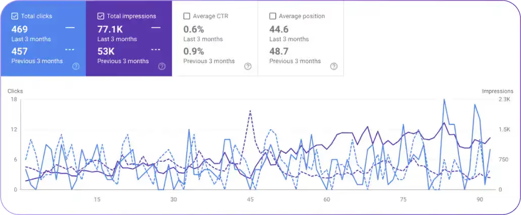
 Better understand your user experience with Search Atlas’ Core Web Vitals Chrome Experience report.
Sliders don’t always display well on smaller screens, causing layout shifts and making the page feel all over the place. Mobile users already deal with smaller screens and slower connections, so adding a slider into the mix just makes everything more frustrating.
Plus, it often messes with one of the most important Core Web Vitals—cumulative layout shift (CLS). If things shift unexpectedly (like the slider popping up and down), it creates a terrible user experience.
Google’s not a fan of that, and neither are your visitors. If your page layout keeps changing, your mobile visitors will bounce.
4. They’re an Accessibility Nightmare
Website sliders might look sleek, but they’re a total headache for SEO accessibility. 🤕
Imagine navigating a site with a screen reader or just using the keyboard to move around—sliders don’t make that easy.
The constant movement and changing content can confuse users who rely on assistive technologies to understand and interact with your site.
 Via Colibri Theme
For example, if the slider automatically moves and doesn’t give users control over when it switches, people with visual impairments can easily miss important information. Plus, if there’s no way to pause or stop the slide show, it makes the content nearly impossible to follow.
For users who rely on keyboard navigation, sliders can also be tricky. Sometimes, they’re hard to navigate without a mouse, or the tab order doesn’t let them access the next slide smoothly.
In short, sliders create barriers that make your site less usable for people with disabilities. And, if your website isn’t accessible, you’re not only losing out on potential customers, but you could also be risking legal issues.
5. Your Key Content Gets Buried
Instead of getting the chance to engage with your main message, visitors are distracted by a rotating carousel of images or text that doesn’t give them a chance to dive into the core content.
This is a big deal because your SEO depends on how good your blog engagement is.
If key content is buried under a flashy slider, it’s harder for both users and search engines to focus on what really matters.
 Create high-ranking content easily Content Genius features to get suggested focus terms, AI images, NLP terms, ideal word count, internal linking, and subtopics.
Users tend to scan websites quickly. If they don’t immediately see what they’re looking for, they’re gone. And Google’s not going to rank a page that buries important keywords and content behind something that’s just meant to look pretty.
So, if you want your key messages, products, or services to shine, get rid of the slider. Place that content front and center where it can actually make an impact.
6. Smarter, SEO-Friendly Alternatives That Work
If you’re ready to ditch the slider, don’t worry—there are plenty of simple, effective alternatives that’ll improve your SEO and user experience without the headaches.
- Static Hero Images: Use one high-quality image with a clear message and CTA for a simple, focused design that enhances SEO user experience (UX).
 Use On-page Audit Tool to check your image’s file, alt attributes, format, and more.
-
Well-Defined Sections: Structure content with clear headings and descriptions, improving readability, navigation, and SEO while making information easy to find.
-
Accordion or Tabbed Layouts: Display large content in compact sections, reducing clutter and helping users access relevant information without feeling overwhelmed.
-
Carousel with Controls: Allow manual navigation instead of auto-sliding, giving users control over content interaction and improving engagement.
-
Content Blocks with Clear CTAs: Present key information in distinct sections with strong CTAs for better usability, keyword optimization, and conversions.
Final Verdict: Say No the Slider, Boost Your SEO
At the end of the day, sliders just aren’t worth the hassle when it comes to SEO. They slow your site down, confuse users, and hide the content that truly matters.
Instead, opt for a simpler, more effective approach that puts your most important content front and center—where it belongs. Your site will load faster, your users will engage more, and Google will reward you with higher rankings.
Our tools automate everything, keep track of Google updates and changes with AI, and let you work on more interesting things.
And if you want to boost your SEO with the latest tools, try Search Atlas free for 7 days!